While working at PNI Media, for my first year I was on a team dedicated to servicing our client at the time, Costco (later we would exclusively work for Staples). Both Costco US and Canada clients wanted to focus on accessibility improvements, WCAG compliancy, ADA compliancy for our US client and ACA compliancy for our Canadian client.
We had accessibility assessment documents that detailed every non-compliant issue on the websites, and I sorted through the list to determine whether they needed dev work only, accessibility documentation from me, design work or any combination of the three. Working very closely with the PO and devs, we were able to work through a large chunk of the issues before we transitioned to Staples only work. I was working in-depth on accessibility projects for that year, learning about the dev side of the work, the project management part, the design documentation needed and got familiar with the WCAG, and it was an eye-opening and very enjoyable experience that I am happy to document and share.
Both websites have been shut down since, but below I have detailed some of my favourite projects from that year, to best provide a look into my process and learnings.
One of my first and favourite projects was making sure the slide carousel was accessible. Carousels pass WCAG guidelines, and the one we had on the homepage, and the category page was no different. The biggest issue was we needed to make sure that screenreaders read out and announced what was currently on the page. Because carousels by their design rotate automatically, we needed to make sure that didn't happen when the keyboard focused on the current slide. Automatic rotation and animation also meant that screenreader users would be more easily lost on a carousel, as they would have less control of the slides unless we provided it, and would have less idea of where in the carousel they currently were unless we described it for them.
That being said, I got a lot of my ideas and workarounds from the working carousel demo provided by W3C.
After the initial research, and figuring out how the moving parts of the carousel would work on keyboard and screenreaders, first I defined the keyboard order. As the keyboard order is defined by the DOM, I carefully consulted with the devs on the project before finalizing the documentation. I also added a Skip Navigation / Carousel link at the start, as carousels are largely decorative and visual, so we wanted to give keyboard and screenreader users the option to skip it entirely.

I also created the screenreader documentation, focusing on numbering the slides, and providing navigational references so screenreader users would have a good idea of where on the carousel they were.
.jpeg)
Note: This type of documentation worked for this team at the time, but eventually I did create an improved accessibility documentation for another project and team. You can find more on that here.
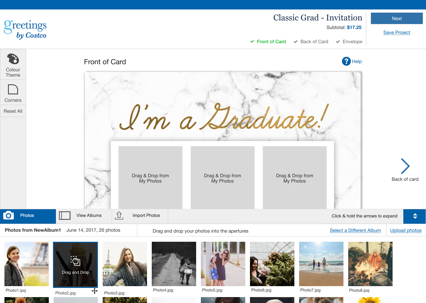
When we worked on creating an accessible version of the drag and drop feature on our photo builder, WCAG 2.5.7 was not officially published, but we wanted to create a solution, as this drag and drop feature blocked major interactions for non-mouse users, so we had marked it as a critical issue.
Some designers had previously workshopped solutions for keyboard-friendly drag and drop, which I was thankful for and took a look at. I also looked at various websites, specifically other photo builders from websites like Canva (who have the most accessible visual builder that I've seen so far), Snapfish, Moo and Vistaprint and took a look at how they approached the issue. A lot of my time researching was spent assessing examples, and reading up on articles from W3C and other resources like Mozilla for how to approach drag and drop.
In the end, I mode changes to the builder design that accommodated keyboard/screenreader users, and some improvements that addressed other issues that had been flagged (1.4.3 Contract Minimum, 1.3.1 Info and Relationships) though the focus of this project was the drag and drop.
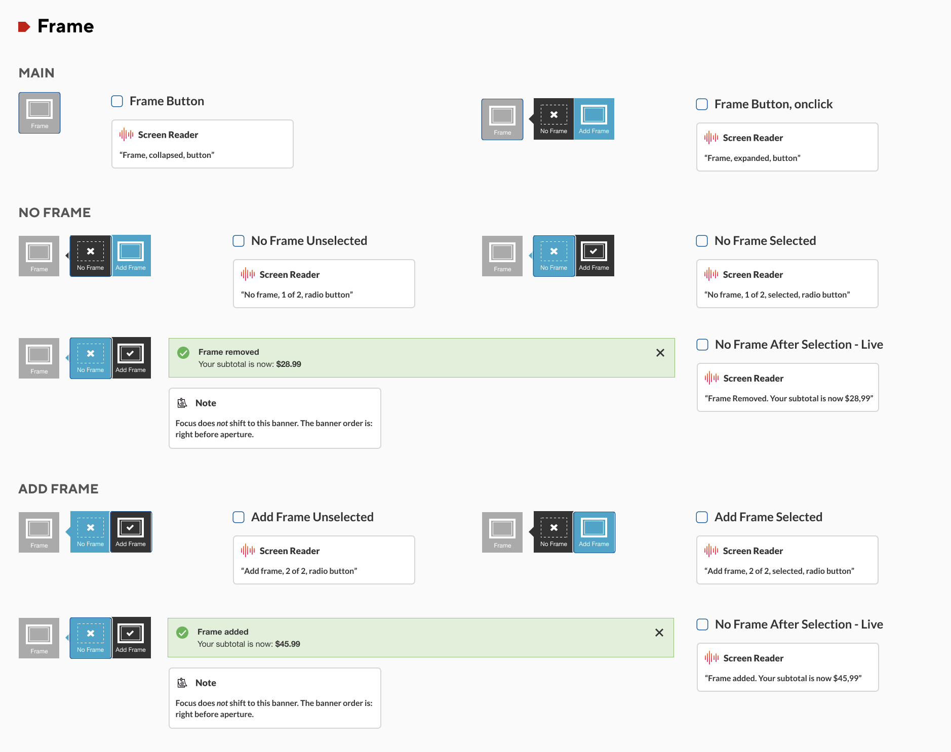
For the keyboard interaction, I focused on labelling that would give keyboard and screenreader users a sense of where the images would go. For this reason, I added labelling to the apertures. Users would be able to place photos by selecting them, and then selecting the aperture they wanted the photo in. For screenreader, I added "announcements" with aria-live whenever a photo was placed, indicating a change on the screen.
You can find the keyboard interaction/flow here.

For mouse interactions, I kept the changes to a minimum and focused on correct labelling and fixing some contrast issues. I added instructional text to the photos, changed some text and background colours. Overall, the design varies depending on whether the user is a mouse or keyboard user, as the functions are different.
You can find the mouse interaction/flow here.
Myself, my design team, and the Costco dev team ran into one issue over and over again throughout our time on this project:
"How do we know if our accessibility changes are working?"
Usually, in UX, we can validate most of our guesswork or hypothesis fairly easily via usability tests. We throw them a link to the prototype on Figma, and see if it works, then make changes.
For screenreader changes in particular though, we knew we would not be able to create a working prototype on Figma the way we usually do it, and any coded working prototypes required code and effort that we could not spare. We could only test after release.
After a couple of months of pondering, I happened to see this presentation at Deque's 2022 axe-con by Annabel Weiner and Courtney Benjamin "Removing Bias with Wizard of Oz Screen Reader Usability Testing". Annabel and Courtney had done the Wizard of Oz test for screenreaders and documented their progress. I had been working on the Costco accessibility project for a year by this time, getting more and more familiar with the WCAG and WAI-ARIA (something that would be required to do the documentation and "be the Wizard" in the test), and we were just starting to look into the visual builder, which was very old, and had the highest number of compliance issues that we'd had, so I was nervous about making a large number of sweeping changes without being able to test it. All that to say, that when I saw the presentation, I knew we had to it, and I shared the presentation with my manager immediately.
Annabel and Courtney's process starts and ends with preparation, preparation and preparation. They defined the landmarks, the HTML and ARIA elements and had them all laid out and prepped. While Annabel was the moderator, Courtney was in the background with all of the documentation and prep work ready, and acted as the "human Wizard" or rather "human screenreader" in this case and read out the prompts when the user interacted with them.
The builder was very complicated, but I didn't want to do a test of the complete thing with finalized drafts of the documentation just yet. So we decided to do a proto-test with volunteer team members with a first draft of the documentation. Nonetheless, the documentation took quite a while and was extensive.

I also decided to take a step further and blur all of the screens. The reason being, we wanted to duplicate the circumstances of a screenreader user on a visual photo builder for our proto-test volunteers.

Quite unfortunately, our client at Costco decided not to proceed with the accessibility project at all, so the test did get shelved, which was a shame. I was excited and nervous to do the test with real screenreader users after the proto-test. It would've been a great opportunity to not only test out the builder features, but to also learn where the gaps in my knowledge around screenreaders were, and to share the findings with my team. However, I am happy to have been started the experiment and I hope to have a chance to try it out in the future.
This project sparked my interest and passion for accessibility and I am extremely grateful to have worked on this project for as long as I did. Not only did I gain so much knowledge of accessibility practices, WAI-ARIA and the WCAG, it was an honour to spend a whole year dedicated to accessibility and learn about the coding and project management side accessibility with the team I worked with.