Assistlist is a charitable organization that provides an online marketplace to buy, sell or donate health and medical equipment. Assistlist's goal is to support those in need of equipment, and those who no longer need their equipment online, and to promote positive environmental action via encouraging the re-use and rehoming of equipment. I've volunteered at Assistlist since October 2021, assisting with user research, and user experience design. This project is something I worked on slowly in my free time in 2023.
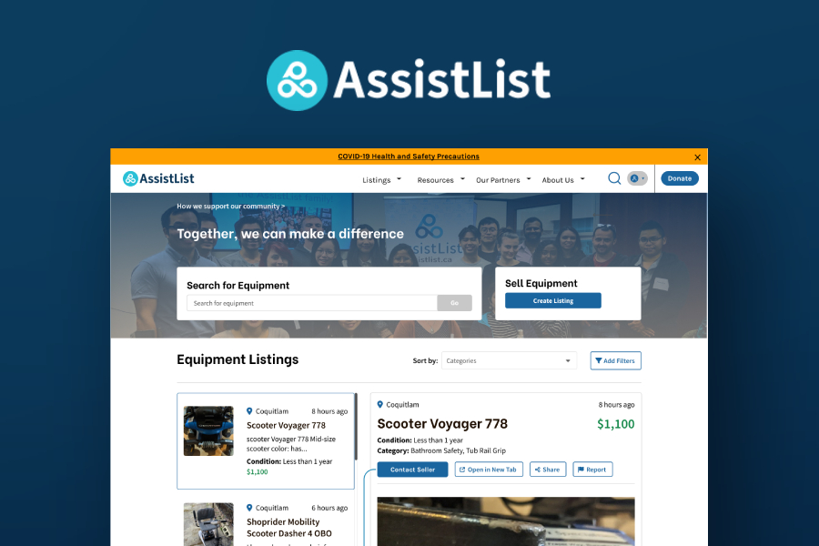
We had been getting a lot of feedback from our users via Hotjar about our homepage / search results page. On our previous search results page, users were redirected to new pages if they wanted to see listings, but a lot of users found this cumbersome, and wanted a way to view the listings on the same page for better navigability.

I spent some time reading through a chunk of the feedback about the search results page, then spent some time looking through Fullstory recordings. I wanted to see if there was anything that the users couldn't verbalize about the problem by taking a look at the recordings, or try to see if there was more to the problem or if any other things on the website was causing the problem before jumping into it. After some time looking at the recordings, I came to the same conclusion as the users: users wanted to easily look at listings and compare them, and our current design was slowing them down significantly- therefore making the listings viewable on the same page was the logical decision.
I took a look at some other websites with listings, as well as multiple eCommerce sites to try to see what kinds of layouts could work for us and which ones are more ubiquitous. If users were specifically asking for a feature, it meant that they wanted something that they already had experience with.
The two examples that I landed on were from the Notion Kanban board, and Indeed. For Notion, listings overlaid the page as a kind of drawer, whereas for indeed, the listings remained on the left side while the listing showed on the right.
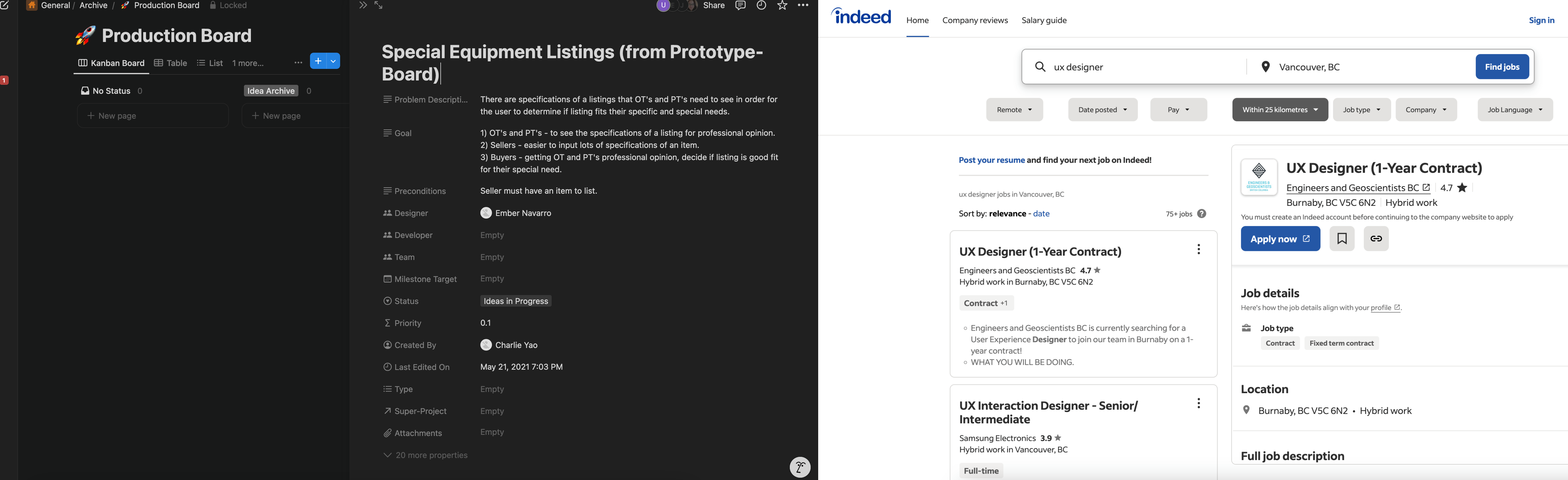
I decided to start off by trying out the Indeed "modeless" method, and the Notion "drawer" method and see how they would feel.


I found that although the drawer method provided more space economy- it only slightly solved the issue that we were trying to solve for- users still had to close and open the drawer to click and view other listings. It may not be as many steps as the current design, but it was still more steps than the modeless version. For this reason, myself and the design team preferred the modeless version.
However, we had another problem. I was told that before I joined Assistlist, we had previously had the Filters at the top of the page, as I had laid out above, but users had had issues locating them at the top, which is why they were prominently placed on the left.
If we were going with the modeless version, I had some doubts about keeping the filters on the left side, as it would take up a significant amount of space, but I went back to the drawing board and tried out some versions that maintained the filters where they were.
Note: I did create mockups of all versions on tablet and mobile as well as I was doing this, but since tablet and mobile allowed for drawers better, the problem area remained the desktop version, so that's the version that I will show here.
Here I tried out a version where selecting a listing pushed out the filters entirely. I was not a fan of this, as the visibility of the filters at all times is important, and users may not see it again after clicking on a listing if they're clicking from listing to listing.

Here I went back to the drawer method:

Since the drawer would keep the user from interacting with the rest of the page anyway, I tried isolating it more visually, and adding buttons for closing the drawer and opening the listing on a new page.
After many conversations with the design team, and taking a look at all versions, we decided that to solve for the issue that we set out to fix, the modeless version was most optimal, and we didn't want it competing for space with the filters.
The feedback we'd gotten about the filters were from quite a while ago and had a different design from what I had proposed initially. Since we couldn't test out the mockups for this project, we decided to go with the modeless solution, but keep an eye out for feedback on the filters after release, and if there were significant pushback, try to solve for that separately, as the navigability was a larger issue.
I'm excited to see the feedback from users, but also so nervous about filter discoverability. I'm hoping that having the filter at the top of the results is a fairly ubiquitous location, that our users will have adapted, but it's definitely the largest callout and thing to look out for after release. Here is the final desktop version of the design: