Yes, a majority of us do skim through the headlines and move on. It's a guilty habit that leaves us with incomplete or even inaccurate inferences. There are a lot of us who are actively trying to keep themselves informed, but finding it time-consuming- after all, it takes time and dedication. Even if news articles are read, a study from NNGroup found that 79% of articles are scanned. From a UX point of view, one could argue that there's a failing in user engagement and we in the design industry could work to encourage that initial curiosity.
I think there are a couple of things that get in the way of engagement.
Firstly, headlines (or the design articles links attached to the CTA) need to prompt users to click and engage and news websites achieve this, because they need users to click as many pages as possible. But websites that have social aspects to them like Facebook and Reddit aren't focused on that. For these websites, the user needs to summarize, and the link to the article is treated as little more than a footnote. These websites are designed for users to stay on the site for discourse, and it is not within their interests for their users to leave their sites. For the source news websites, I can suggest promoting thumbnails with more information, rather than just a headline and a small tagline that prompts further reading. Further, the goal is to get people at least on the article site, and my suggestion as a UX designer for news sites would be to promote a synergetic relationship with these sites.
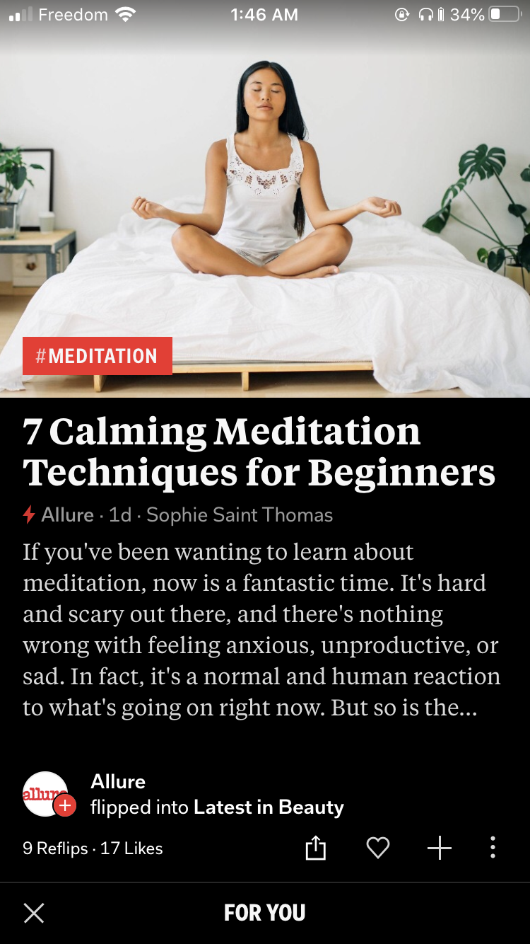
Secondly, as NNGroup noted in the same study mentioned above, text walls written objectively, concisely, market-ably and formatted for scanning yield a significant rise in engagement. Blinkist, a service that aims to help you summarize whole books in 15 mins does this very well. They write and divide their content in digestible chunks with bulletted content, a read-along narrator, large and legible text and with the aim of making it easy and enjoyable to move on from one page to the next. Blinkist makes content enjoyable to read- and breaks up content to be read as a full narrative. We can aim to achieve this with articles- we can aim to make articles a joy to read. Obviously the context is different, but the intent, the initial curiosity is the same, as well as the end result.
Like many others, I have some extra time on my hands right now in 2020, so as a means of flexing unused UX muscles, I've decided to design my own solution to this problem in the form of an app.
You can find the mockups at the very bottom of this article.
According to NNGroup, 79% of users scan articles. This behaviour, although useful in skimming for useful content on Landing pages and websites with large blocks of information, is not ideal for reading through news articles.
With news websites and apps on mobile being primarily available in the form of a feed, there is a higher likelihood of just reading the headlines (or the bulletpoint list) moving on and scrolling further down.

On sites like Reddit, Facebook, Twitter, the UI focuses on comments, reactions, and in Facebook's case your reaction to an article can be painted by the user's relation the poster, the likes and reactions and the comments below.

I interviewed some friends who I confirmed with beforehand would be interested in a news aggregator app, and asked some open-ended questions about their experience with news feeds/aggregators, reading news articles and how picky they were about their news sources.
I found that those who wanted to be better informed simply didn't have enough time in the day to read through entire articles. There was some apprehension with keeping up with the sheer volume of news updates, retractions and different sources- so they didn't like having to sift through so much volume.
I asked to watch 2 of my interviewees while they browsed news their usual ways. One of them went to trusted sites while the other one searched through Reddit. Given time constraints, my first interviewee only read 2 and a half articles "properly" to their satisfaction, and the second interviewee only read the comments sections for most of the articles, and went to the source site with apprehension. They explained that the potential for popups and ads kept them from doing so.
I think that the most valuable thing I took away from my observations was that an ideal news aggregator would keep their articles in-app, would save time, and be free of distractions.
NNGroup's study found that articles that succeeded in readability were written objectively, concisely, market-ably and formatted for scanning. As noted in my blog post, I noted that Blinkist had managed to tick all boxes for books. As such, I decided to analyze the features I felt would serve my own, and would help increase engagement
Blinkist breaks down articles into chunks (or blinks as they call them)- displaying them in a large legible font in dark mode. In addition, you can listen to the blinks- narrated on the app.

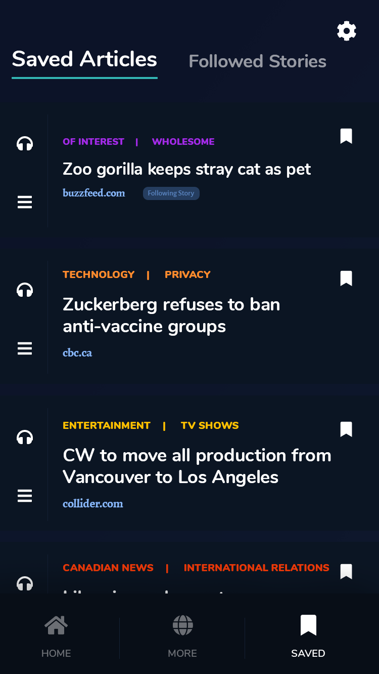
I think Blinkist succeeds because it makes information digestible. It achieves that with slick intuitive UI, and a way to save articles into Libraries and tag and highlight them.
Feedly is focused on creating accurate feeds that "filter out the noise". With Feedly, you can choose the topics and sources of your choosing. I was also delighted to find that most of the articles are in-app, and formatted for readability- they also have a dark mode. Feedly is still a "feed", though- which I am trying to avoid and create the antithesis of.

Flipboard has a unique way of presenting it's articles- each article had a dedicated page, you flip through. Although this method forced you to focus on each article one at a time, I found the transition a little overwhelming. Each article had about 2 paragraphs in large readable text- after which you'd be redirected to the source.
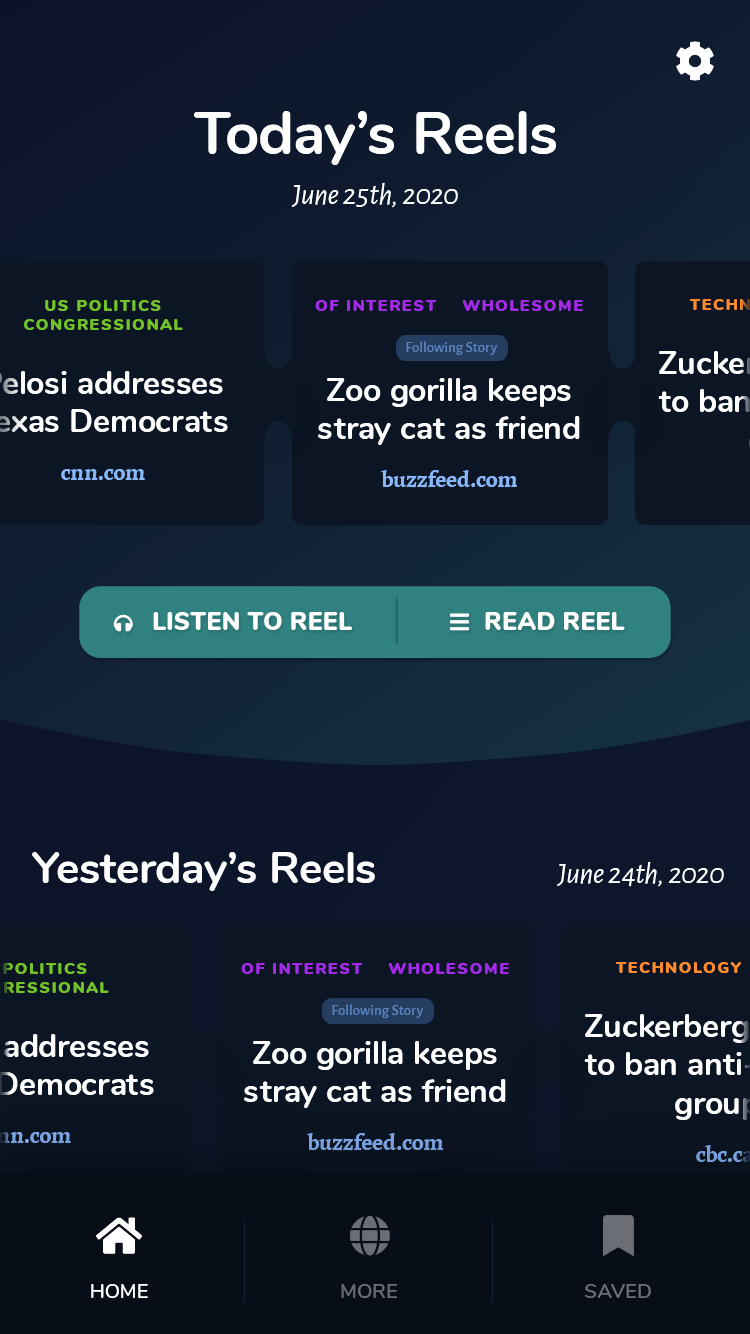
The main thing that I want to achieve with this app is a user experience that delivers news articles succinctly, quickly and in a way that prevents scanning.
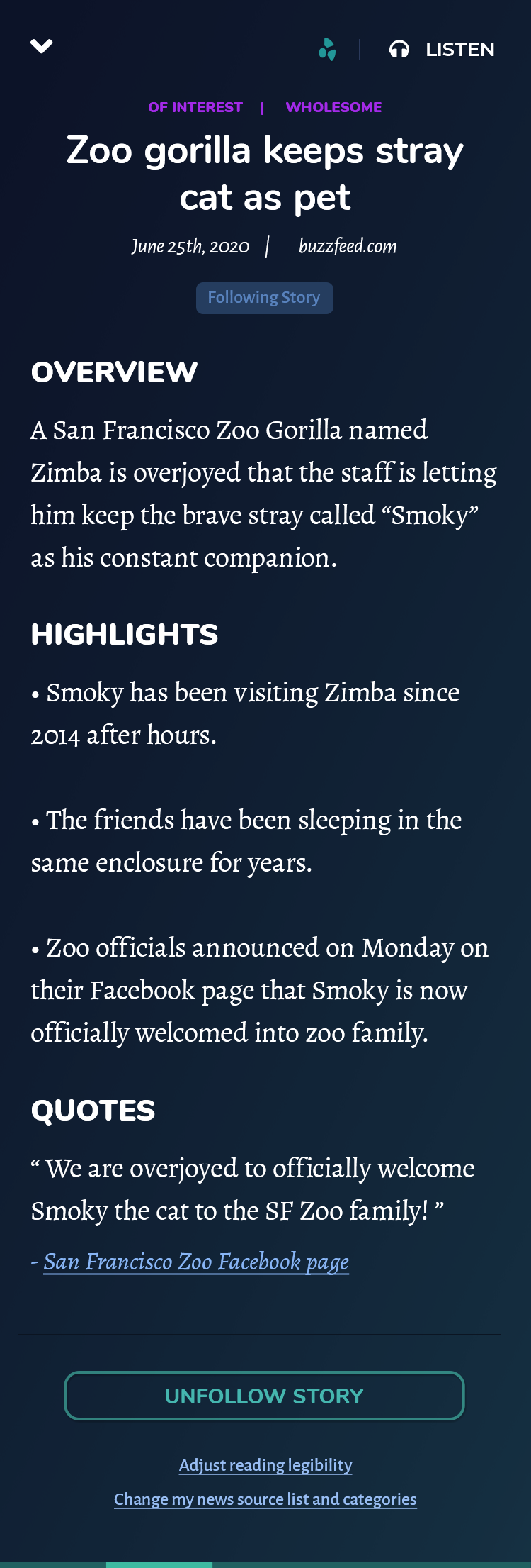
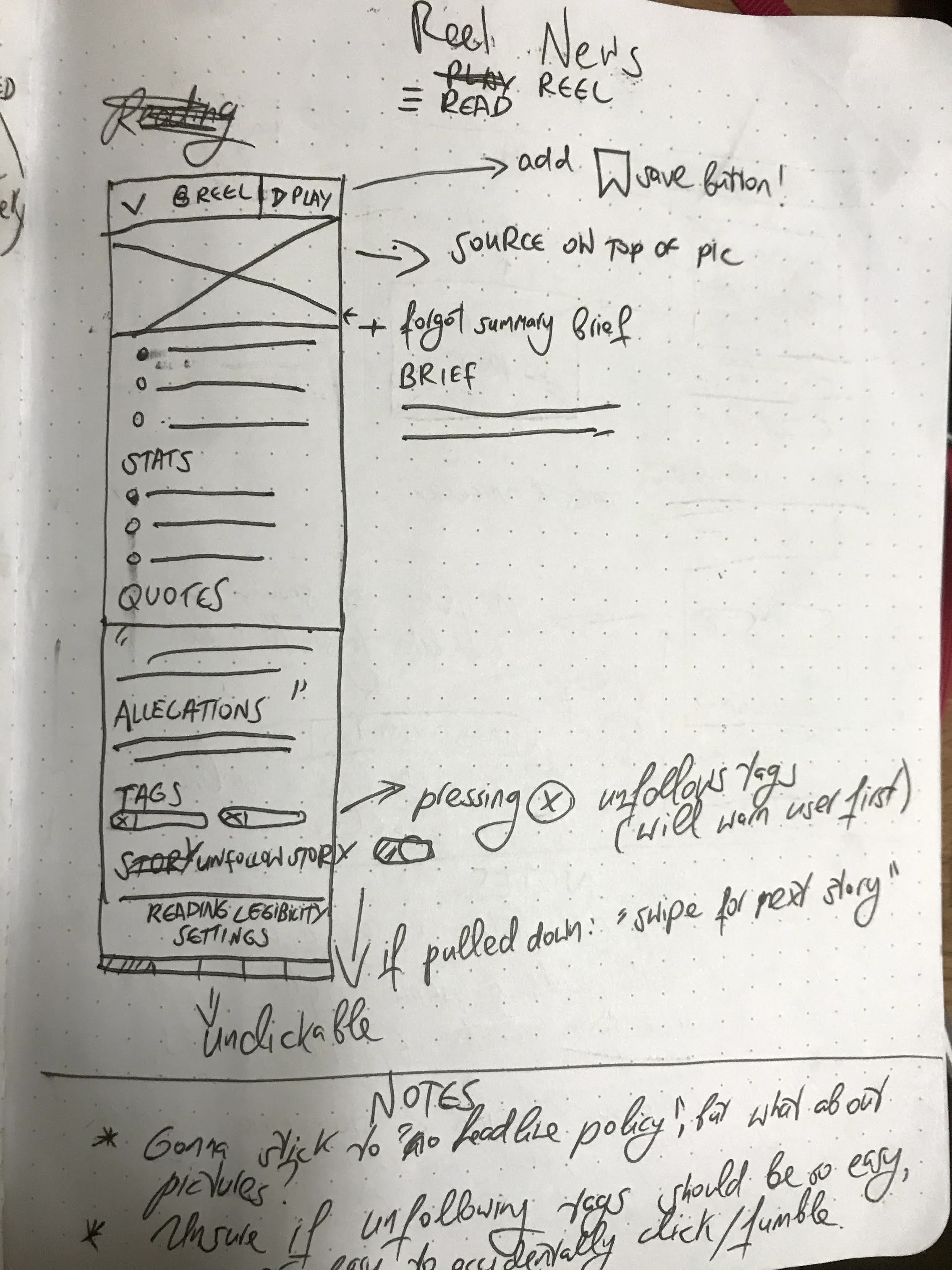
Some articles are lengthy, and some are redundent for SEO reasons. Most of my interviewees main gripe was that fully reading an article took too long because you needed to break it down in your head sometimes. My app will have writers and journalists rewrite and breakdown articles to: a summary, a bulletlist of highlights, statistics, allegations and quotes.
Some people can retain more if they listen to the news- and it certainly saves time, so like Blinkist, I will create a "Listen/Play" option. Narration is pricy however, and with the volume of articles that would need to be rewritten and narrated, text-to-voice services like Acapela Group would suffice.
One of the other qualms my interviewees had was article selection from a sea of news articles and sources. Creating bundles, and even better customized bundles is a good way of taking away decision fatigue from users. My app will therefore have about 5-8 articles per day (or maybe per week) to listen and read.
Since this is a project of my own making, I am settings the following limitations:
Created from a median of my interviewees and their behaviour.


First, I decided to name my app Reel- like a news reel as opposed to a news feed. My first try at mocking up a home screen resulted in something that very much looked like a feed though.
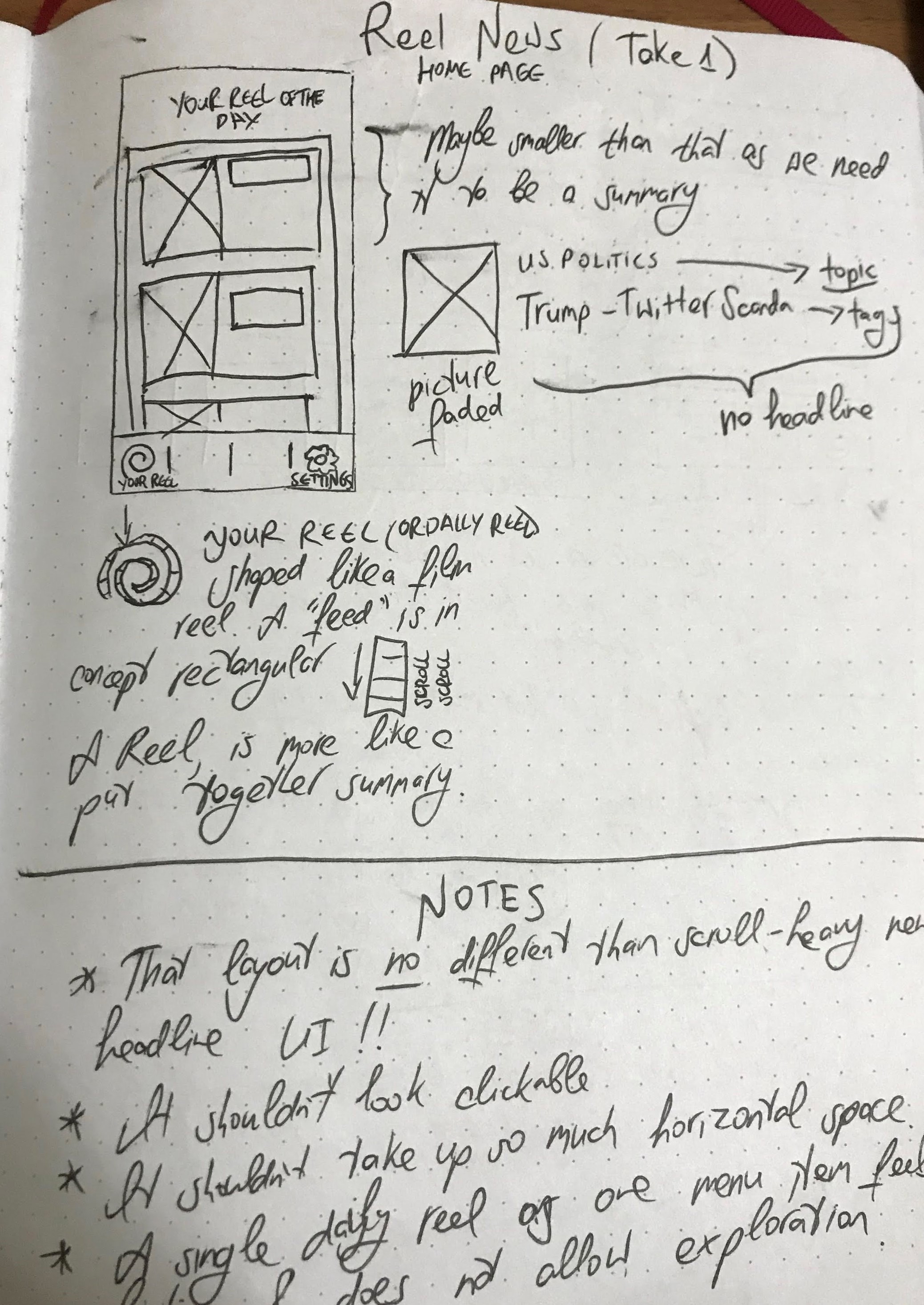
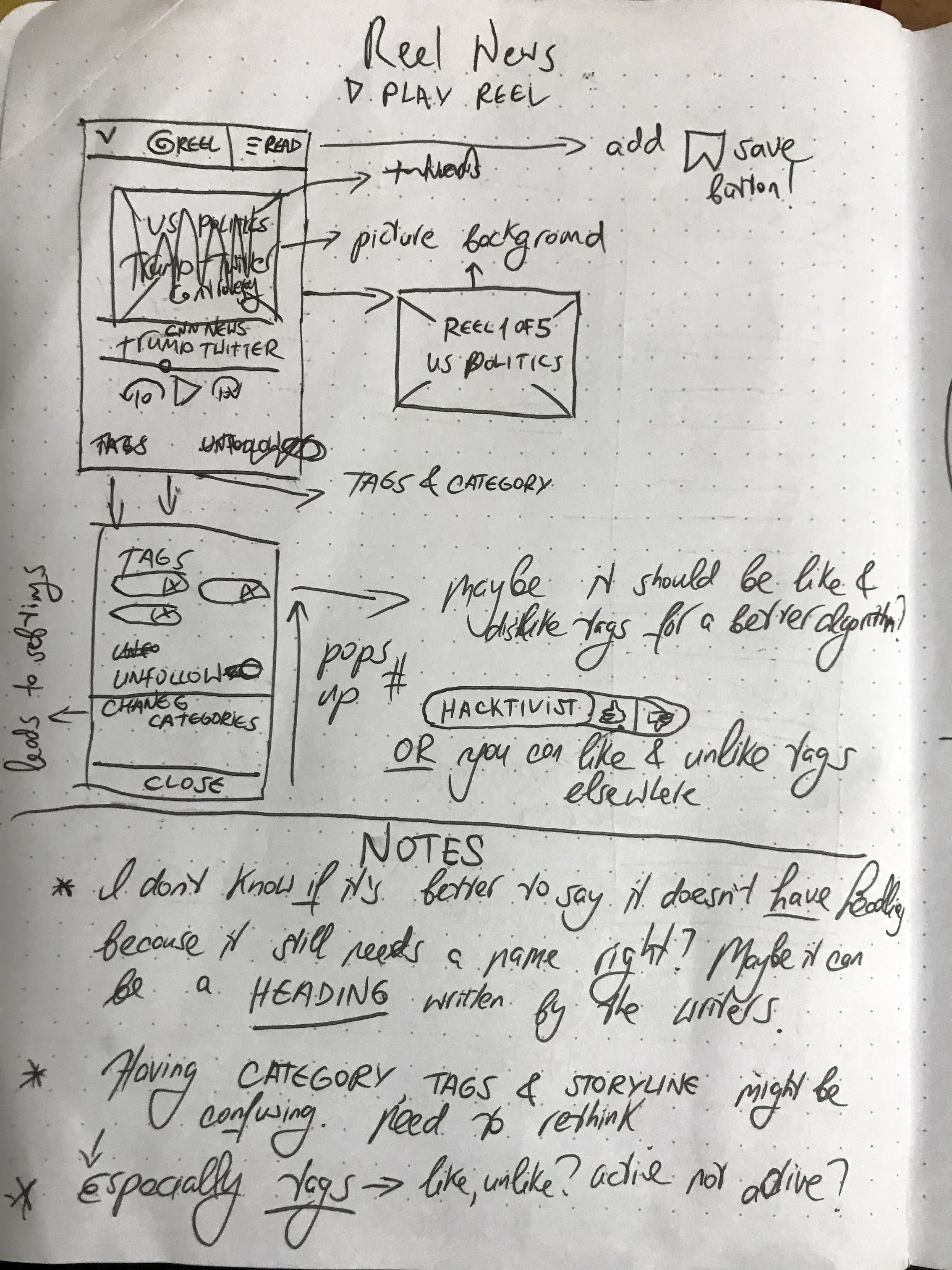
Here are some more mockups and subsequent notes/changes.

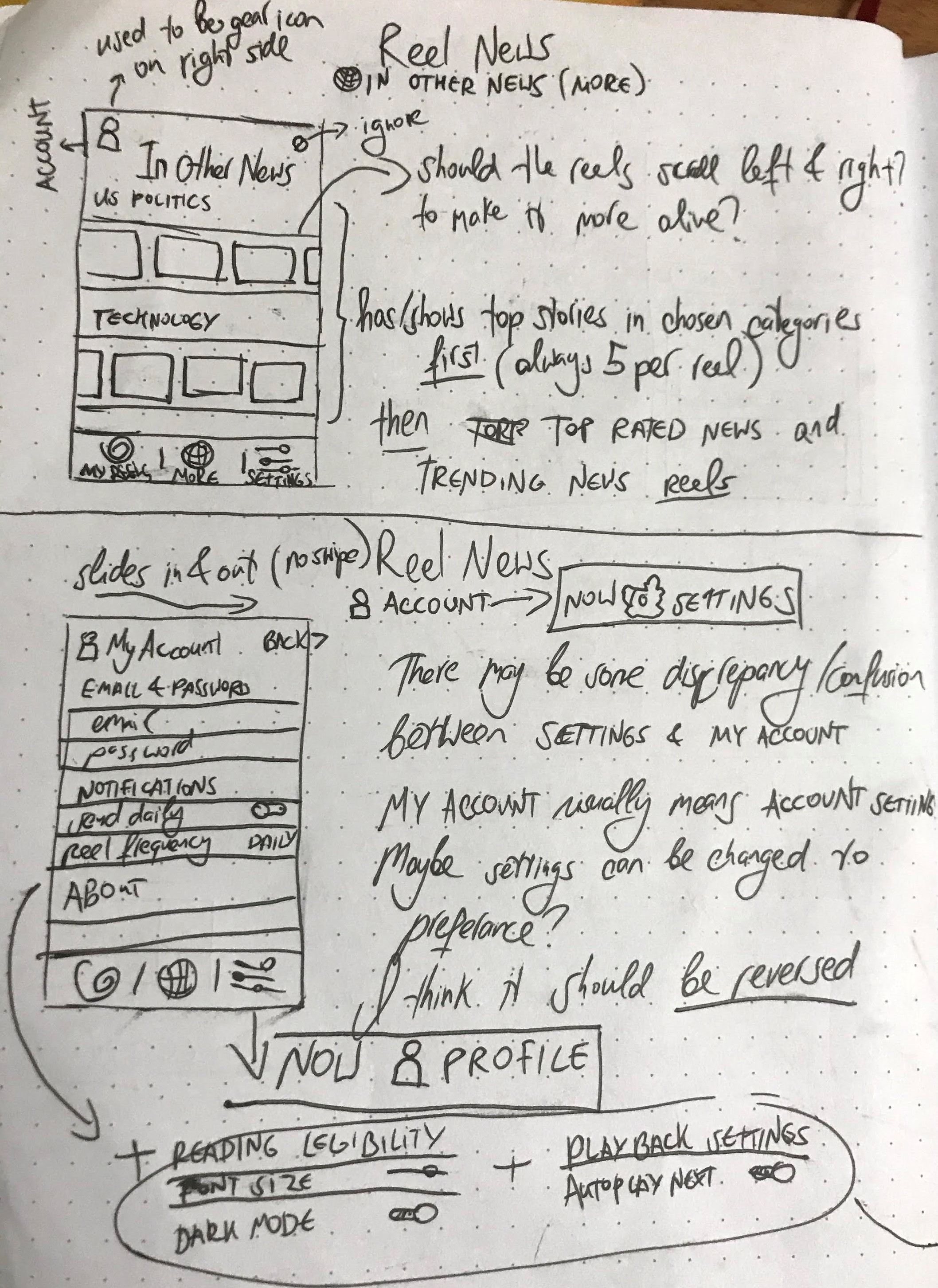

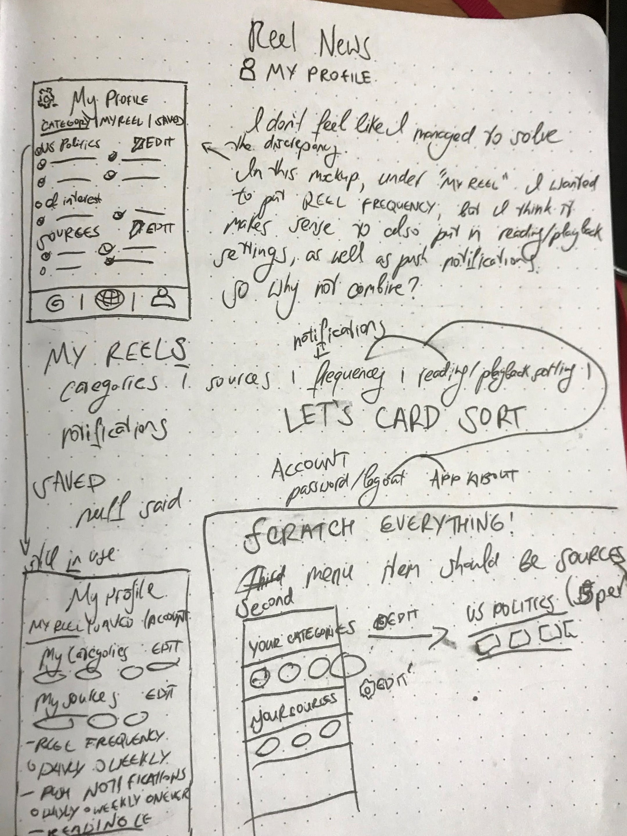
As well as my initial logo work
Here are the mockups I have created so far. I am still in progress, and might update the design here and there.