Not too long ago, I read this article where the author Ivan Sipilov posited that, contrary to Steve Krug's very popular "Don't Make Me Think", users have evolved and crave more details when it comes to long-term decisions. The article does say that Krug's principle fully applies for short-term decisions.
I do agree with the article overall, but having witnessed both ends of this phenomena, I had my own thoughts to add.
Years ago, when I worked for a company that sold furniture online as their resident UX Designer, I witnessed Sipilov's phenomena on Fullstory and through general feedback we received online. Users spent sometimes hours scouring product pages for any and all information (we added more and more information and it was never too long), then the returns policy page, even the company About page. They would close the tab and return over the course of months before making a decision.
I also witnessed similar behaviour on Assistlist, a charity organization I volunteer at that hosts listings for used health medical equipment. Users, particularly posters spent a good deal of time scouring the site for any information they could get their hands on to validate the safety of the site and understand the process.
However, years after I had worked at the furniture store, I was banging my head against the wall trying to get users on Staples Print and Marketing to read 1 line of text. This was around the time I read the article, so I had to laugh.
We had had issues for years trying to help our users, if not understand the difference between the print options we offered (paper type, materials, accessories), but to at least be able to make the decision somewhat easily. We even started an AI project to help the process.
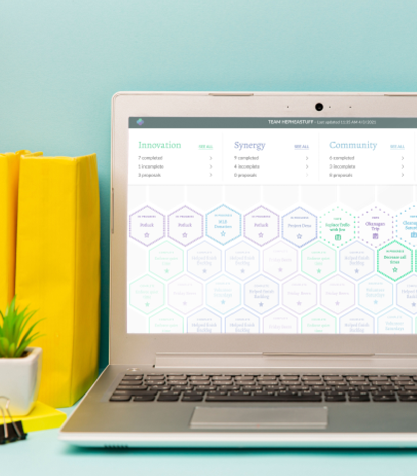
For my Cards and Invitations project, after release, I found that users did not understand the difference between the 3 different card types we offered, even when there was a line of text on each product explaining what they were.
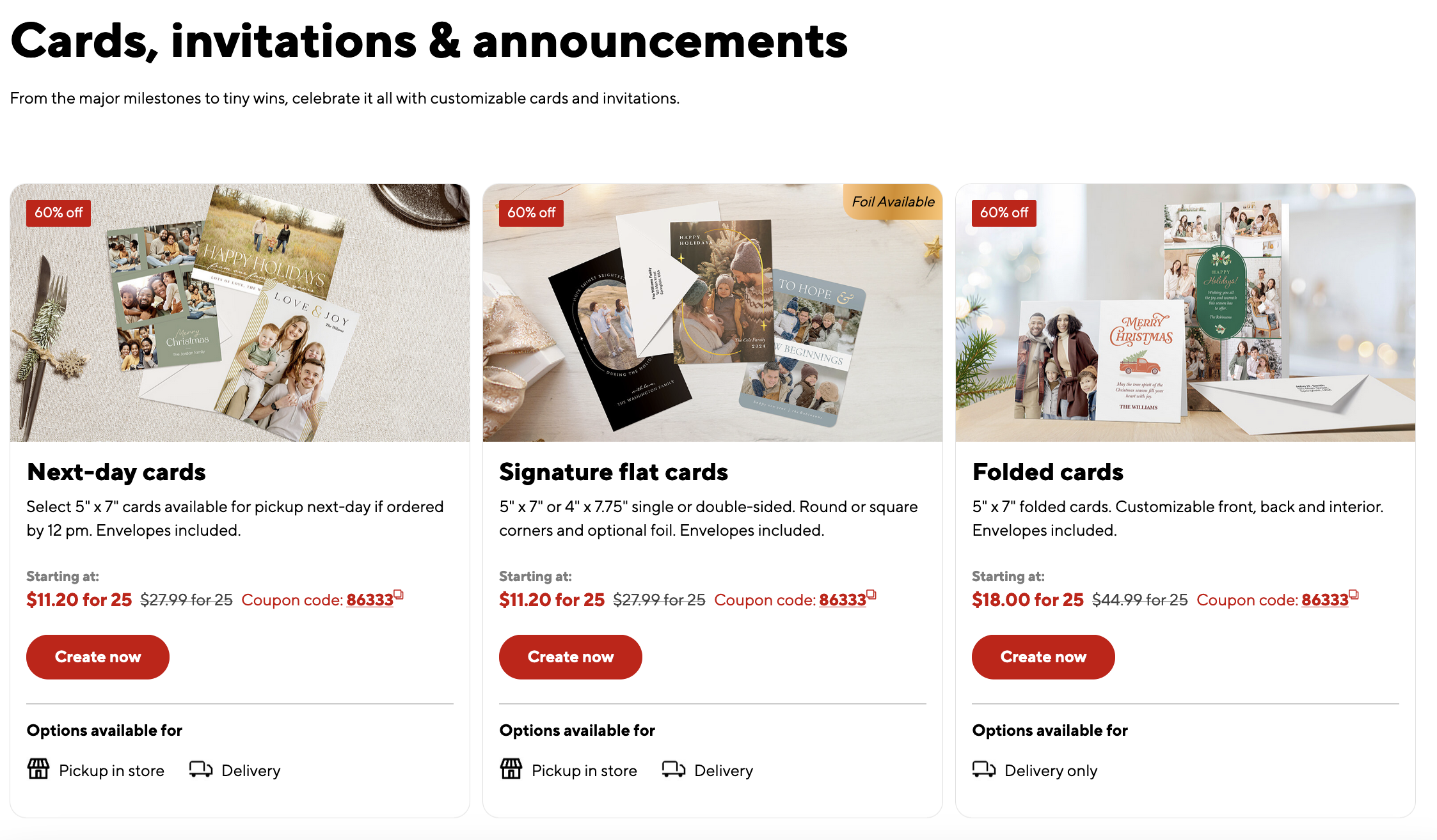
I did a usability test and witnessed multiple users scrolling past the description and choosing a card type on intuition. We found that we really had to hold their hand to make the information digestible.
The problem was users weren't fully engaged when buying print products- at least not all the time. What I found interesting was that there were "easy decisions", like choosing designs and customizing them. These were things that they knew how to do, and wanted to spend time doing. Users blanked or froze when making decisions between the different products and product options, but even when they weren't happy with some of the design choices on the site, they would spend a significantly higher amount of time on design.
I agree with the article that it does somewhat come down to long-term vs. short-term decisions. It's completely understandable that users would be more prone to research and be more engaged when they're going to choose something that will last, vs., something that will be discarded (like print products)
But I think perception of the product and the process does come into play as well. When I interviewed users for other projects, they always described Staples print as "quick and easy" even when they'd had problems on the site, and even when they'd had to come into the store to talk to an associate to get their product printed correctly.
I think most people have this idea that you just walk into a store or quickly go to a website and get something printed- there are no middle steps. People don't know print options or what they are, and in most cases, I found that they were very very resistant to learning, even if they were printing, for example a very large poster for an important event.
It's like they're so certain of the process and what to expect from the outcome, they're not that worried about the decisions that they have to make on the way there. You order the print--> you get something printed and you hang it up or hand it out and you're done- the only thing they have to worry about is the content (not true).
To users, print product content and messaging is important, the rest don't matter, so they are resistant to learning about it.
Where long-term products face scrutiny and it's best to offer as many choices and as much information as reasonably possible, short-term products have the opposite effect where users will refuse to allocate any decision-making where they perceive they don't need to do so.
This became a problem at Staples where users had to make the decision to choose the print product that best suited their needs, and the solution seems to be: A. Either re-contextualize the decision making (What do you need the product for vs. What paper do you need?) or B. Emphasize and educate them on why the decision matters.