.png)
Our UX team had a problem that we had been trying to solve for for a while: We found through multiple tests and studies that users did not understand some of the differences between paper types, print accessories and other options that we offered. Most users, we knew, did not want to expend a lot of energy learning, and simply wanted to print and go. However, buying the right print product did require a certain prerequisite amount of print knowledge, especially for more complex jobs, like outdoor banners, or certain types of posters. If they're physically at a store, that's not a big problem, as print associates at Staples can ask the right questions from customers and gauge what they need. Online, however, we found that without that guidance users were getting stuck or exited early during the "product discovery" stage- on landing pages, on search results pages and sometimes product pages.
At the time in early 2023, AI had just entered mainstream popularity, so our team wanted to try something: What if we used AI to act as an online associate, ask the user the right questions and then lead them to the correct product?
Since AI was new, we knew that we needed to do quite a bit of testing to even visualize what the experience looked like.
We started with a Lean UX to help us define our problem, our users, our preferred business outcomes and user outcomes to help us as a group center around the problem from both a business perspective and user perspective.


We moved on to solutioning in two parts: first doing a Crazy 8's exercise where each person comes up with 8 solutions, then the second part where we each sketch out 2 top solutions.


From here, we transformed each solution into a hypothesis, then tried to figure out the risks and assumptions for each, then finally figuring out what we can do to address those risks.


After all of this, we were able to place our hypothesis on a prioritization matrix- rating each hypothesis by risk and value. Unfortunately, since all of our ideas involved AI, which was fairly new and burgeoning, all of our hypothesis had both high value and high risk. This meant that we had a long way to go in terms of testing and experiments, but that we had a lot of high value ideas we could test out.

We wanted to try out the barest, MVP versions of each hypothesis to see which one users would be more likely to respond to and understand. Would they respond better if it's more of a quiz, would the users respond better if they have to type out what they want in it's entirety in a paragraph, or do they prefer more spaced out questions, how would they respond to a chat-like feature- these are all questions we had from the Lean UX Canvas. So I mocked up a very quick entry point of the experience and a one page mockup of each concept we were testing out for a quick concept test. We wanted to see if users were likely to click into a "quiz" or "chat" experience on a landing page, and then we wanted to get the users impression of each concept and see which one they responded to better.

Ultimately, we tested 4 concepts:


Since this was in the early days of AI and we purposefully did not mention AI until the last question, most test participants were confused and unsure about when or how they'd get a response from tests 3 and 4. For tests 1 and 2, participants had already had a lot of experience with both quizzes and chatbots, so they were straightforward. However, participants had very negative reactions overall to the chatbot, and were largely ambivalent to the quiz.
For tests 3 and 4, we asked participants to write down how they would fill out the forms they see and answer the questions. Participants had a lot of difficulty with the open-ended experience, as they were unsure of what to write, and what kind of answer we, the form needed from them. Whereas with the canned questions, we found that they were happy to have suggestions and had a lot easier time answering the question. This told us that users prefer a lot more guided experience as opposed to a self-started one.
We didn't mention AI on the test itself, but we did ask them after what their opinions on AI were, and found that a majority of the users were excited by AI and would be willing to use AI to help them find a product. We decided that after this initial concept test, we would mention or demonstrate that the experience was AI.
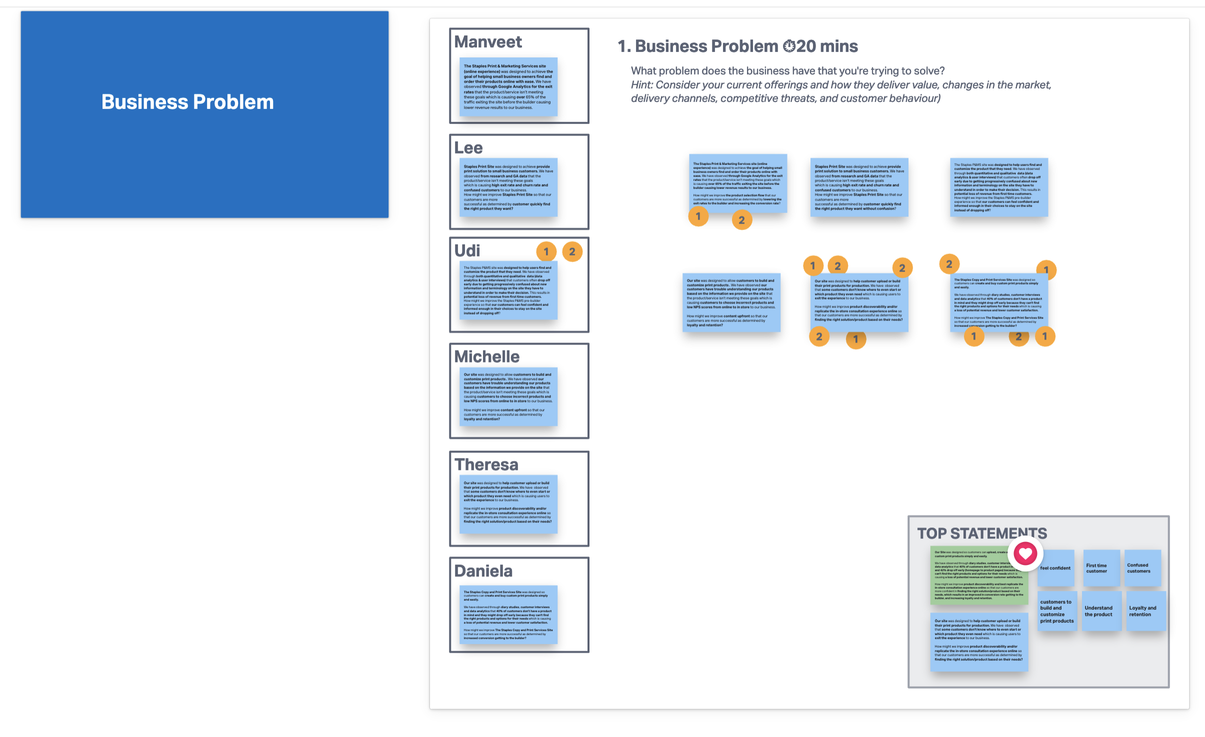
So now that we had an idea of the approach, we still needed to get an understanding of what kinds of questions we needed to ask the users. In our concept test, we had simply put in "Where, What, When, Who, How, Why" as a filler, but I wanted to emulate the in-store experience. As mentioned above, Staples associates do an excellent job of helping customers decide on a print product when the customers don't know anything about print. If we wanted to emulate that experience online, we decided that the best course of action would be to interview and find out from print associates what they ask, and understand their process.
I interviewed associates at 7 stores in the Washington area. I told them to pretend that I was a customer and gave them 3 made-up scenarios so I could gauge what kinds of questions they asked for each scenario.


I found the interviews extremely helpful. Store associates have a level of expertise and encyclopedic knowledge of print products and customers that gave me and my team a lot of great insights that helped not just this project, but others too. The main findings/insights that I found were:
And most importantly, through the scenarios, I was able to gauge the common questions that associates ask in consultations and put them in a graph like so:
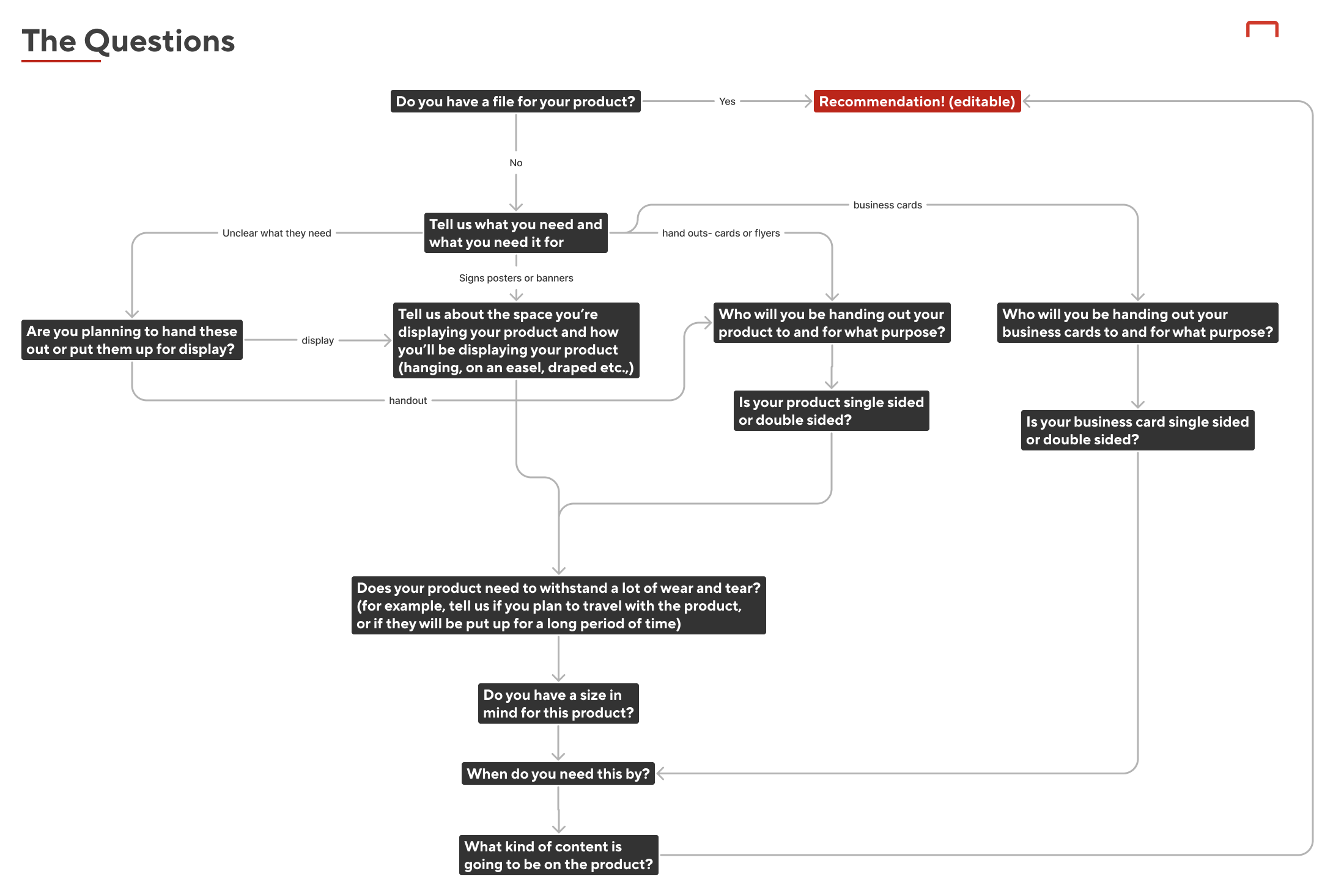
This helped us get a better idea of what the end product would look like, especially the starting point (which would always be "Do you have a design file ready") and it would also help the devs that we would work with later develop the AI.
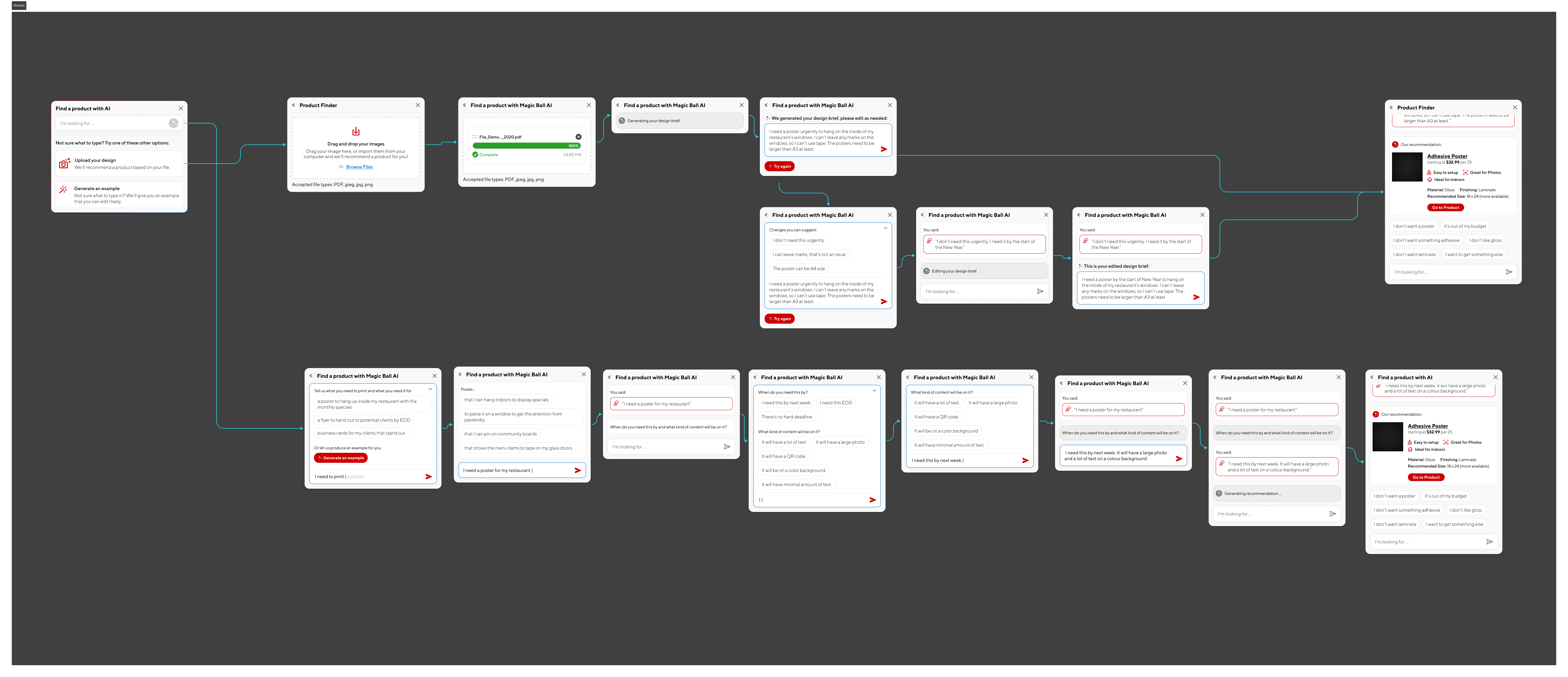
I wanted to create a first draft of a prototype next, and test it. However, since this would involve AI, prototyping would be a little harder to manage, and would not be possible on Figma. So I settled on doing a Wizard of Oz test using Protopie.
Since the first question was "Do you have a design file ready?" we decided to divide participants into 2 groups- those who had a file, and those who did not. In the screener, I asked those who had a design file to have it ready and send it to me.
This is a Figma version of the prototype that I designed. We wanted the user to be able to type in their own answers, so we opted for Protopie for the test version.

If the participant had a design file, the idea was that we would write a prompt on their behalf guessing what they need, which they were free to edit and change.

If however, the participants did not have a file, we would ask them questions. This would start a little broader with "Tell us what you need and what you need it for", basically establishing their use case. We gave them the option to generate an example sentence, as can be seen below.

If we needed more information, we would ask them a follow-up question, which the "wizard" in the scenario (me) would type up:

Ultimately, with enough information (and time for me to complete the different mockups per participant) we would lead them to their individualized results page. I wanted to give the users the option for a best fit, a budget-friendly version and a quickest to deliver option. I also wanted to toy with the idea of creating "tags" for each type of product that spoke to the use case of that product, like "Easy to setup" "Great for Photos" "Ideal for Outdoors". This would help users understand what they need, and it could be a starting point for us to start categorizing our products by use case as a kind of database that the AI development team could use.

We would stop the test here, and tell the participants they couldn't interact with the page, but that they could look and tell us what they thought. After doing some practice runs with team members, we initiated and conducted 10 tests total- 5 of whom had a file and 5 who didn't.
(The Wizard of Oz testing setup took a lot of time and was liable to human error during the live test, but I did attempt a similar AI prototype on my own time later with just AI, which you can see here.)
As talks with AI dev teams and companies continued, we realized we needed to come up with a less "bulky" version of the initial mockup and build an MVP version, with much of the same flow but fewer features. We decided to try a small modal, much like the ones that had started to pop up in other places by then, like Grammarly GO, and Notion.

This was presented to the stakeholders and AI dev teams we were in conversation with.
I would love to say that we were able to bring it to fruition, but the project was stalled from here on out. I did love learning about how to design for AI, how to prototype for it, and I learned so much about the processes of in-store associates that would help our team with other future projects.