TL;DR
As a part of the site experience improvement team at Staples Copy and Print, I created a product flow for Cards and Invitations that required a different flow from the other products. The project involved managing with multiple dev teams, many edge cases and creating new components for a comprehensive and usable flow for both our seasonal customers and our non-seasonal customers.
Project overview
Our team at Staples Print and Marketing had been working on a site refresh with redesigned flows that would work for all of our products, we had to make an exception for cards and invitation products. Other products in our catalogue had a flow that focused on letting the user select the materials, and different print product options first, as a majority of our customers came in with their own designs, rather than choosing a template design that was available on the website. Cards and invitations products were different, because we knew that although customers uploaded their own design for the majority of the year, there were large spikes in sales for Cards and Invitations products that had template designs on them. For this reason, we needed to come up with solutions for a flow that would present the customers with both templates as well as product options.
Initial Research and Workshop
First, I did some preliminary research before scheduling a workshop with key stakeholders. For the research, I took a look at the sales data the Product Owner shared, noted the current observed flow of Cards and Invites products, and the potential flow should we launch the product with the site refresh redesigns without making adjustments, so we could better see where it needed work.
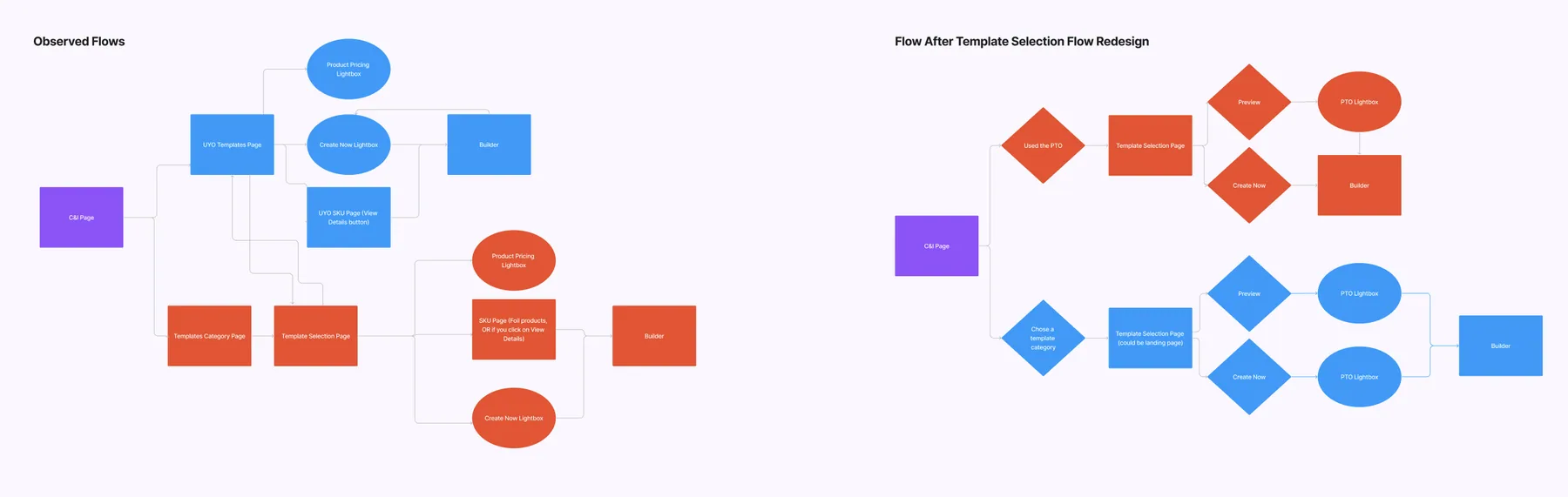
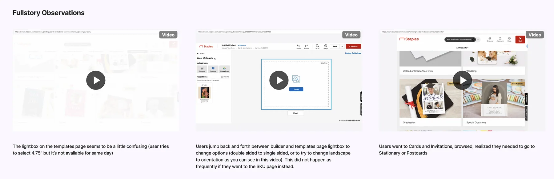
I also spent some time on Fullstory observing customer behaviour and called out some faults of the current flow that we could improve.
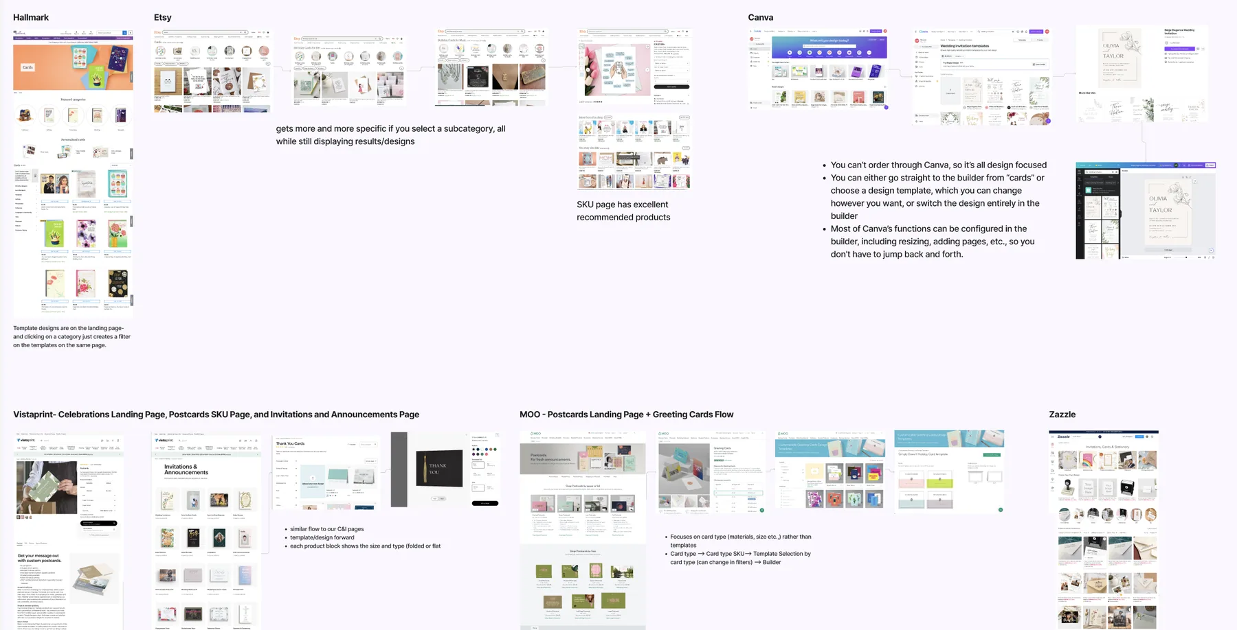
Finally, I took a look at similiar products from our competitors and highlighted some interesting solutions that they had.
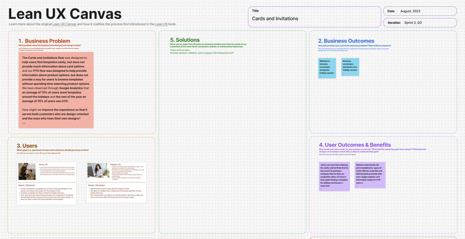
With that, we were ready to start our workshop. At Staples, our team had been utilizing the Lean UX Canvas tool for our workshops. Since it was a smaller workshop consisting of 4 people and because we were all very familiar with who the user is, and what the problem was, I decided to do a modified mini Lean UX that focused on solutioning. For this modified version, we briefly discussed the business problem, who we were trying to solve the problem for, and what we wanted to achieve for the user. I also presented the research findings above so that we were all clearer on what we wanted to solve for, and to help give us ideas for the solutioning stage.
For the workshop itself, over the course of 4 sessions, we focused on brainstorming solutions, and quickly sketching up the more practical and popular ones.
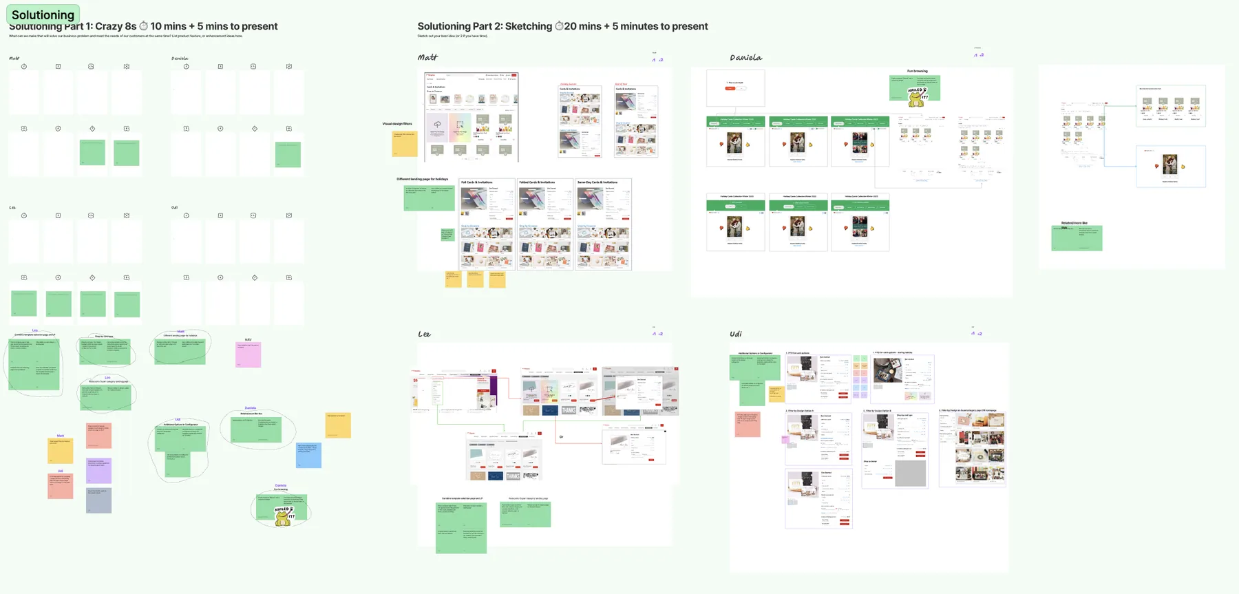
We found that the proposed solutions mostly revolved around the larger flow of Cards and Invites, and how we might improve it so it would work all-year-round, as well as some solutions that focused on making template selection more fun for the user.
We wrote hypothesis based on each solution, wrote down the risks and assumptions for each, and listed what we could do to mitigate the risks. In between each step, we placed each hypothesis on a Prioritization Matrix, measuring the risk and value of each hypothesis.
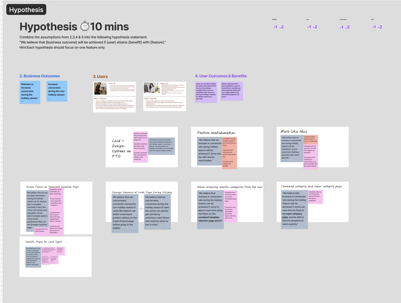
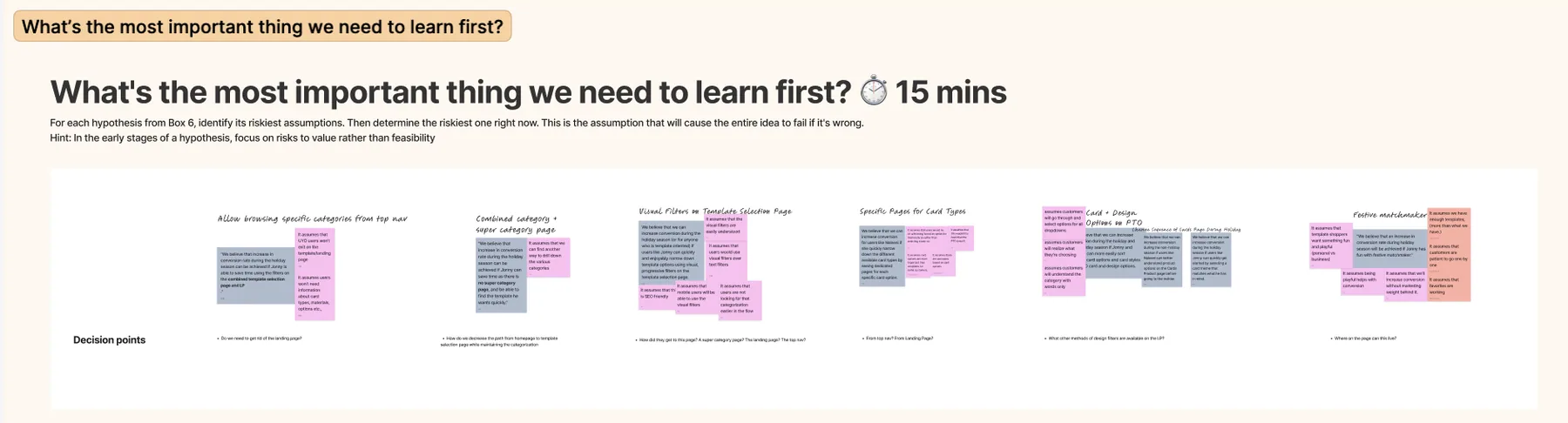
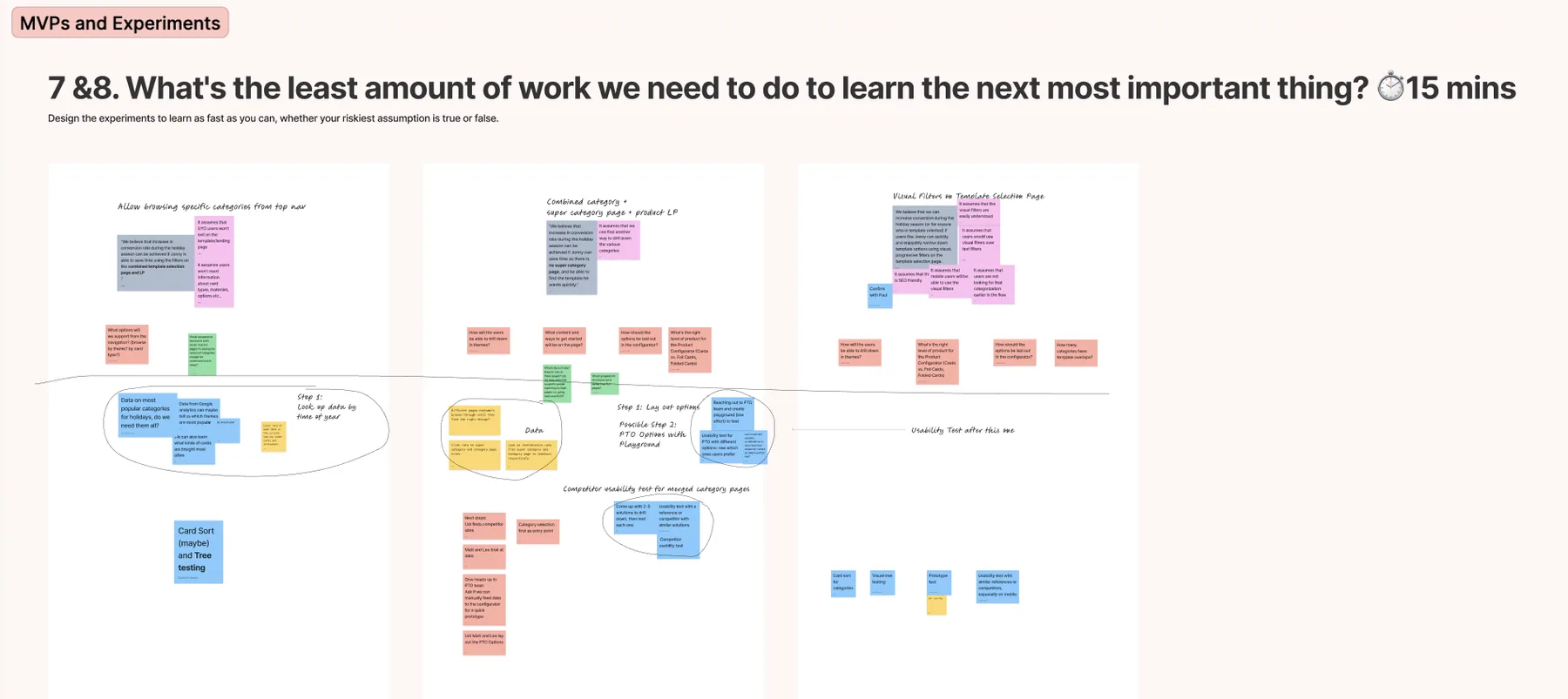
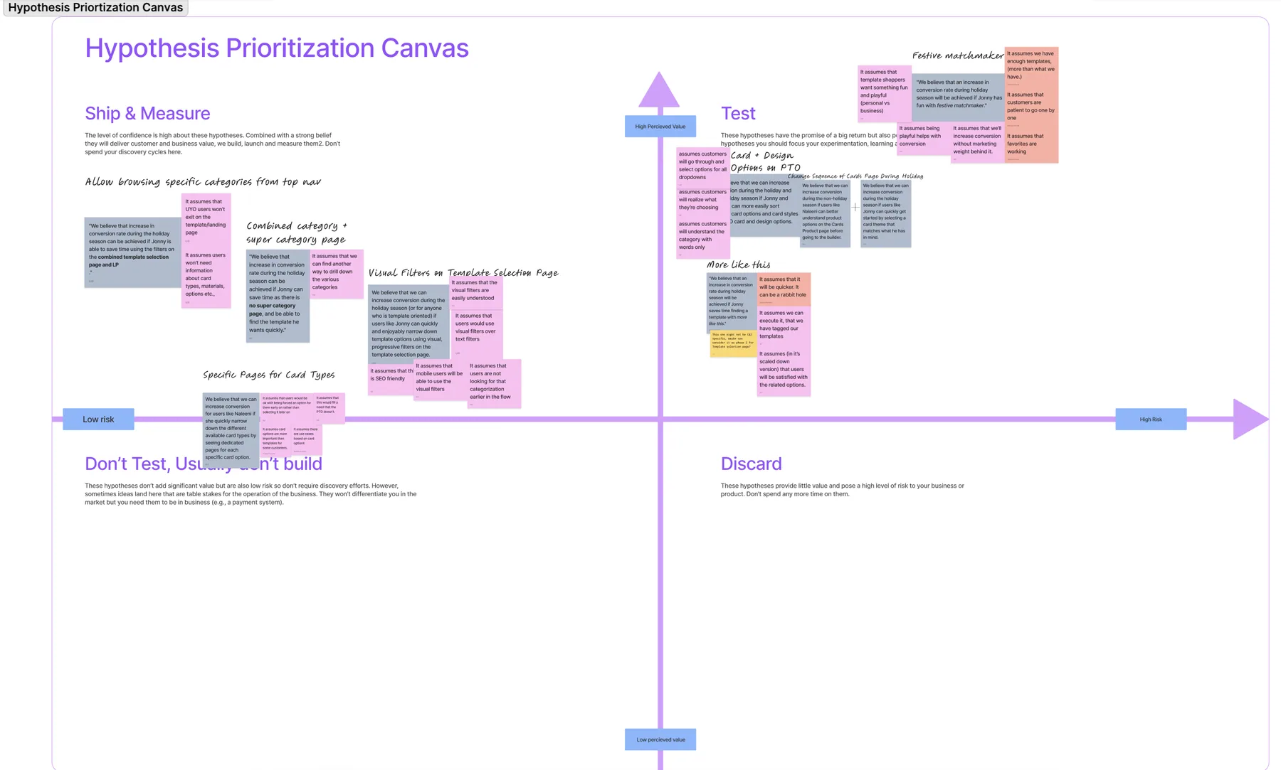
We were able to decide on the following key solutions:
- We would cut down on the subcategory pages and create a clearer path to templates via Visual Filters.
- We would create a combined Category and Super Category page that took elements from the already designed new Category Landing Page and Supercategory Landing Page.
- We would allow users to browse and access specific categories of cards and invites, as well as template categoris from the top nav.
Ideation Part 1: Working out specific solutions and a complicated/uncomplicated flow
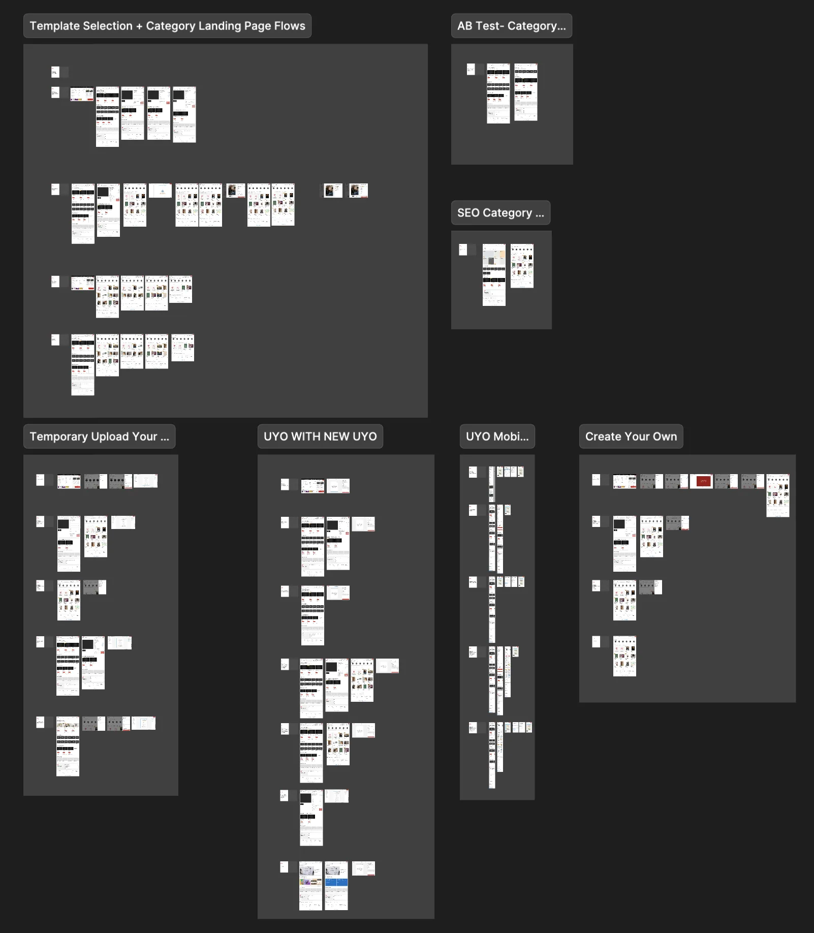
We still had some issues that were exclusive to cards and invites due to the how different the product flow and needs were from the start. As I worked through the flow, I kept uncovering constraints that pulled in different directions. Maintaining existing components as much as possible meant I couldn't always design the cleanest solution. Technical feasibility across multiple dev teams meant some ideas had to be reconsidered entirely. And keeping the flow uncluttered while accommodating two distinct user paths- template shoppers and upload-your-own customers- was a constant balancing act. At each point I had to make a call: is this the best design, or the best design we can actually ship?
For one, the card options available were very limited, which would make using our configurator hard to use for our customers. We didn't want users to run into "That option is not available" over and over again.
I kept running into various other issues, as I progressed. This meant that at various points, I would consult our team, I would consult various dev teams, I would talk to other product designers who had created the pages and components that we were using to try to come up with solutions for all of these various issues.
The hardest part of this was:
- Maintaining the components that we had designed as much as possible and making as few alterations as we could for just this one product.
- Making sure that the changes we were proposing was technically feasible for the timeline we had in mind for the multiple dev teams who would be working on the project.
- Keeping the overall flow easily navigable and uncluttered while making all of the changes.
Ideation Part 2: Design System Contribution
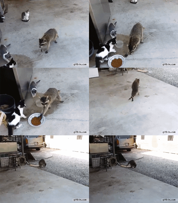
Much of the components and pages that were utilized for the project were previously created by others on my team as part of our newly created design system (which made me feel like a raccoon when I popped into other's Figma files to copy their components at the time). I cross-checked every component and evaluated whether they would fit into the flow that I had created, and whether any changes/additions would be required to the components, and thus the design system. If there were additional changes to be made, like adding new selectors on the product selector page, I talked to each designer who owned the component and we worked together to add that to the design system. All in all, the Cards and Invitations page required about 4 changes to components in design system.
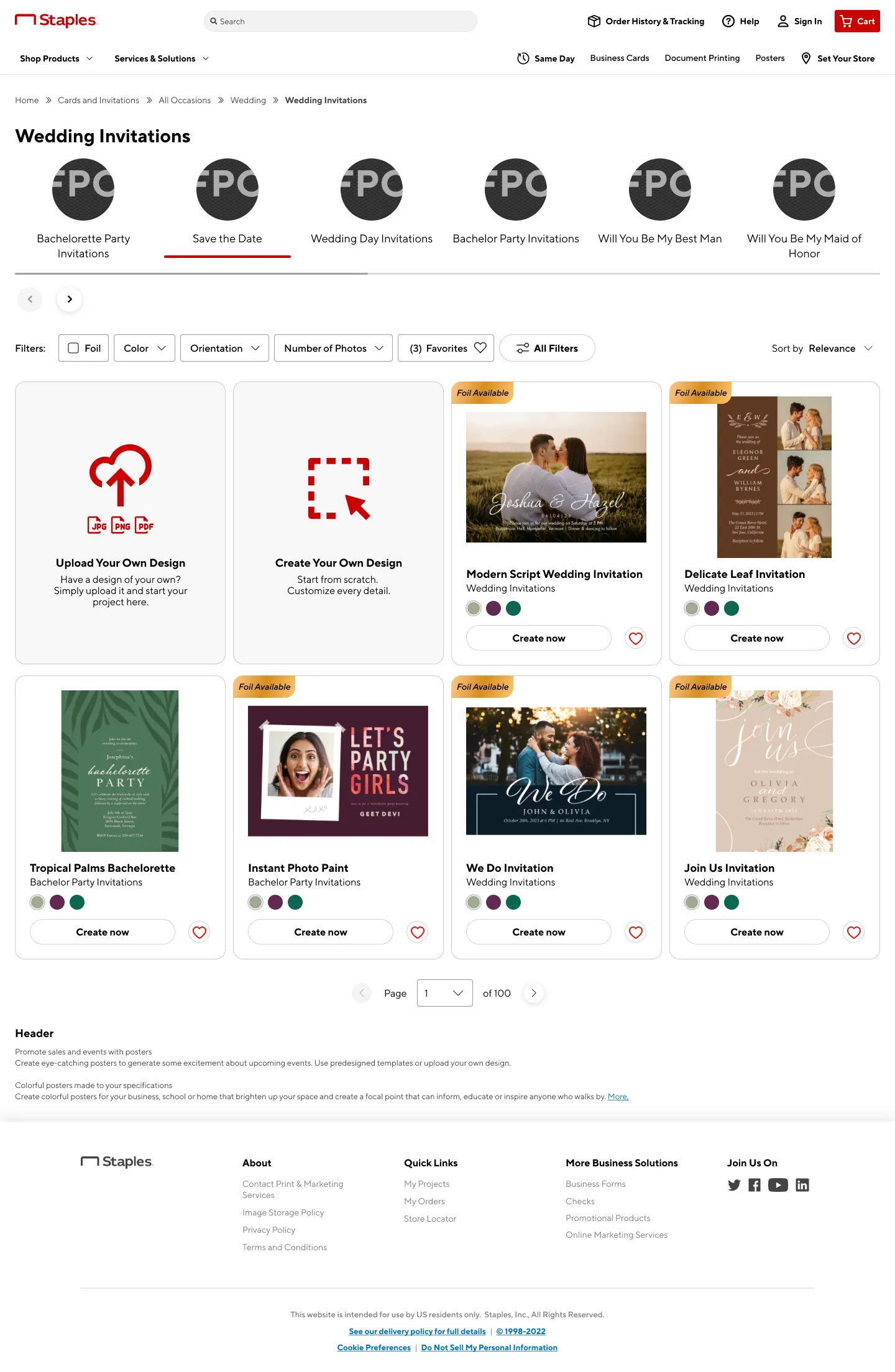
There were 2 components that needed to be created for the project: the Visual Filter and the Card Selector. They could not be produced from components we already had from the design system, and they were essential to the flow that I had created and functions that we as a team had agreed upon.
We had seen several versions of the Visual Filter on other competitor sites and decided that it was an optimal way for us to allow users to browse different categories of templates easily.
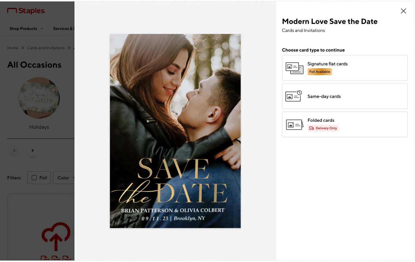
I also had to design a Card Selector specifically for the project, as we had decided to divvy up the card into 3 separate categories.
Both components as well as the newer buttons and icons involved were created and added to our design system.
I also did some accessibility documentation for the new components, and took the opportunity to redesign the existing accessibility documentation. You can find more on that here.
Results after Release
During the next holiday period after release (Thanksgiving), we found an 18% decrease in bounce rates, 70% of which was in the landing page.
During the non-holiday period, there was a 5% increase in conversion and 9% decrease in bounce rates. There were improvements, but some downsides that needed investigation.
The improvement in bounce rates was encouraging, but the picture wasn't clean- users were spending less time on the pages and conversion in non-holiday periods remained flat. Because the Cards and Invitations release coincided with several other projects launching at the same time, I needed to isolate what was specifically attributable to this flow before drawing conclusions.
Follow-up investigations
After release, we found that although the bounce rates improved, users were spending less time on the pages, and conversion remained the same. The project was released at the same time as many other projects, so I needed to pin down any issues that we could fix for the flow that I designed. For this, I spent some time looking at Fullstory to get an idea of where users were getting stuck:
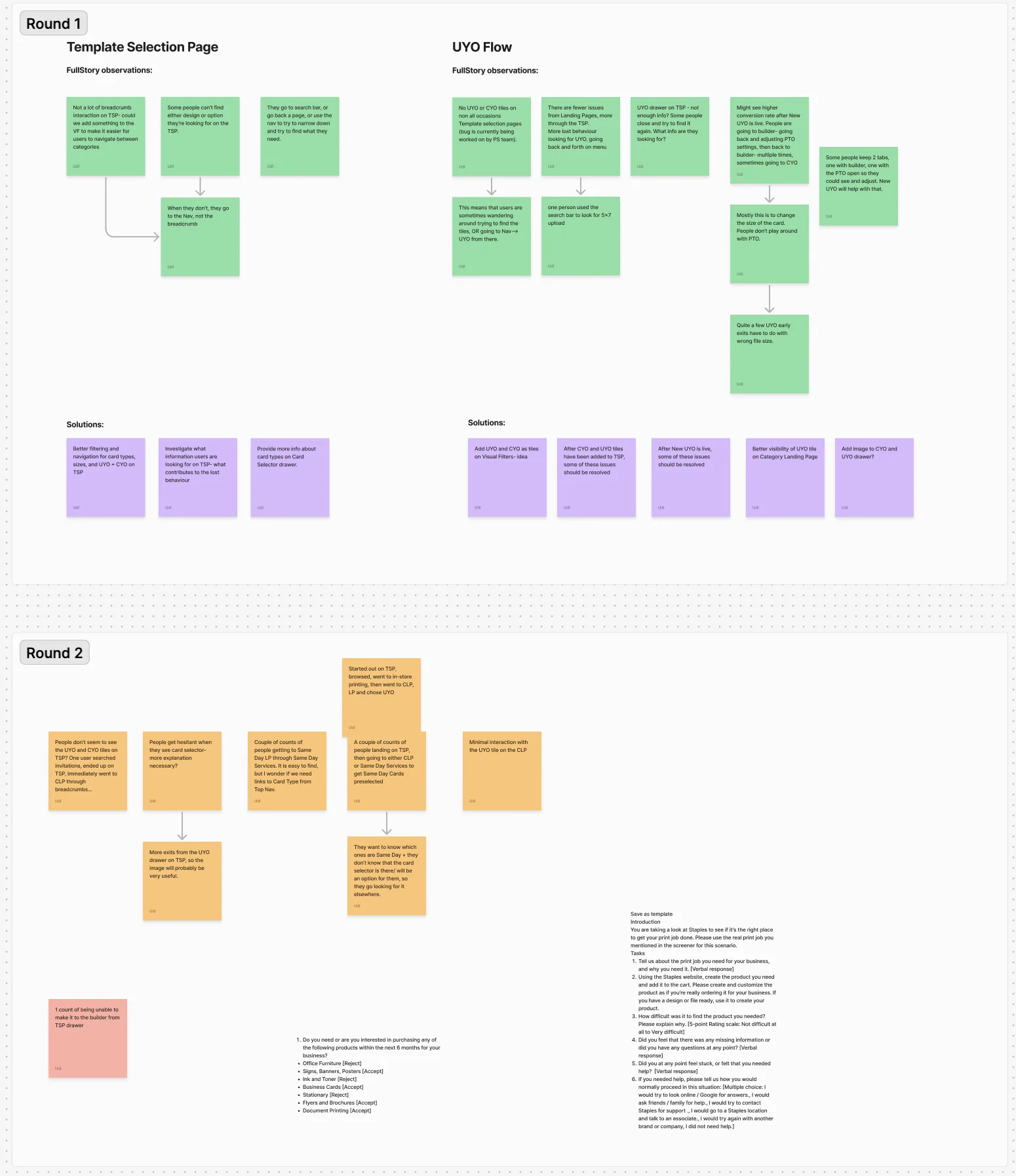
This gave me an idea of where to focus, but I was still unsure of "why" the users were exiting at certain points and what information or lack of information made them exit. So I did a usability test on the whole flow, and tested both template and non-template users:
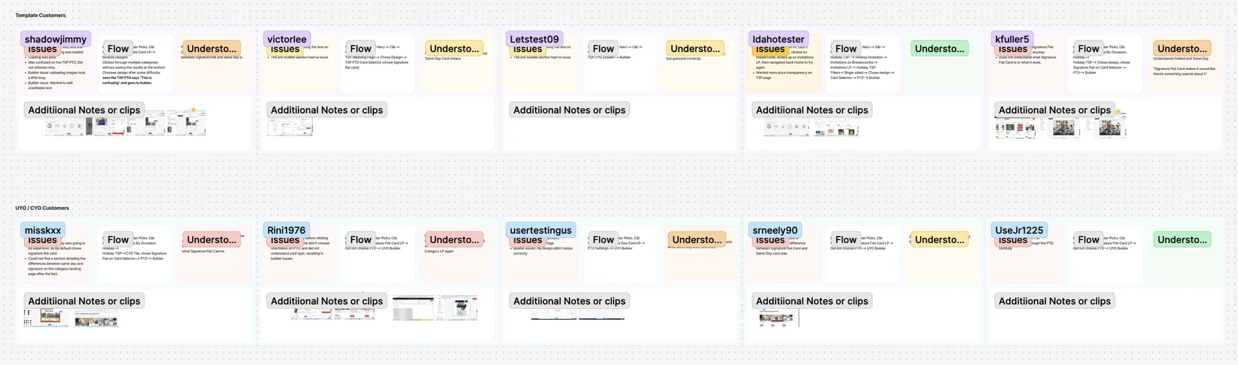
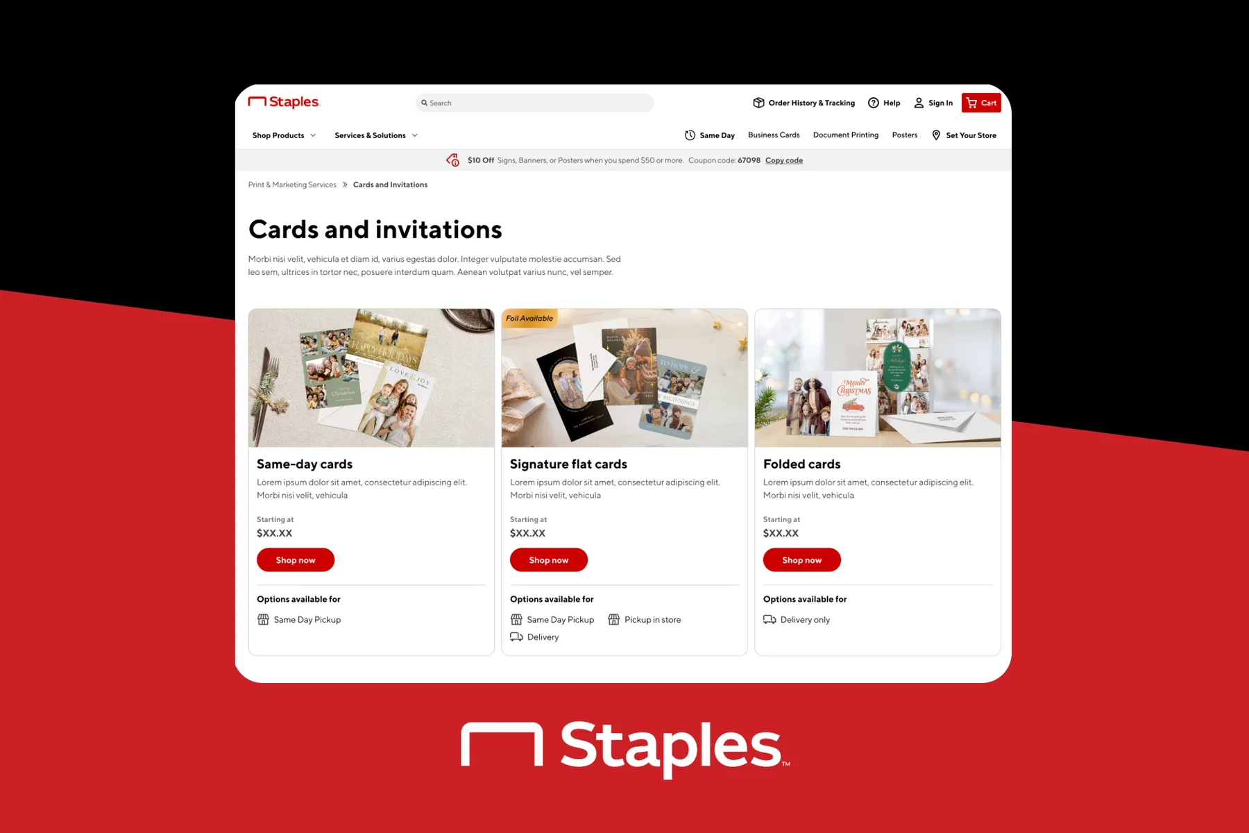
The usability test surfaced something I hadn't expected: the confusion wasn't primarily a visual design problem. Users were being asked to choose between three card types- Same-Day Cards, Signature Flat Cards, and Folded Cards- without understanding that these were fundamentally different kinds of attributes. Same-Day is a fulfilment type; the other two are format types. Presenting them as parallel choices was always going to create confusion, regardless of how well the UI explained them. My redesigned Card Selector improved comprehension noticeably, but the apprehension didn't go away- because the underlying category structure was the real issue, not the presentation. I presented the findings with my team, and we decided on some Action Items.
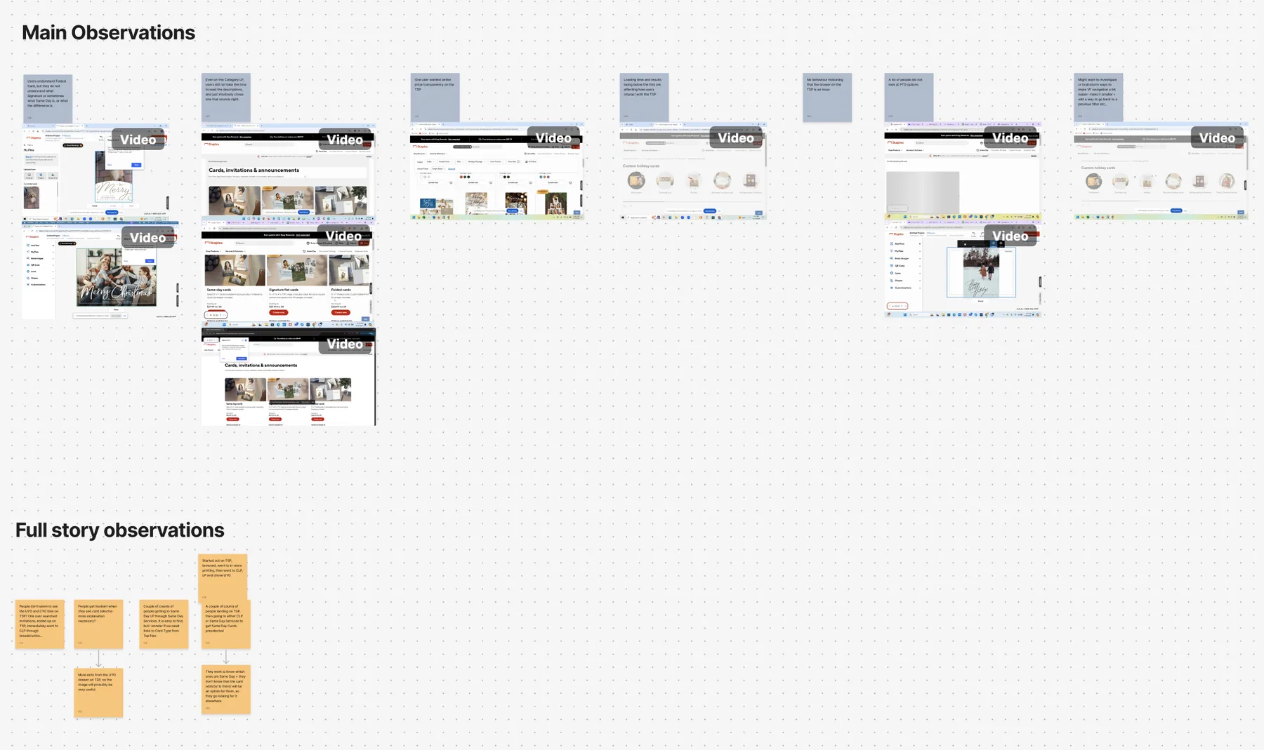
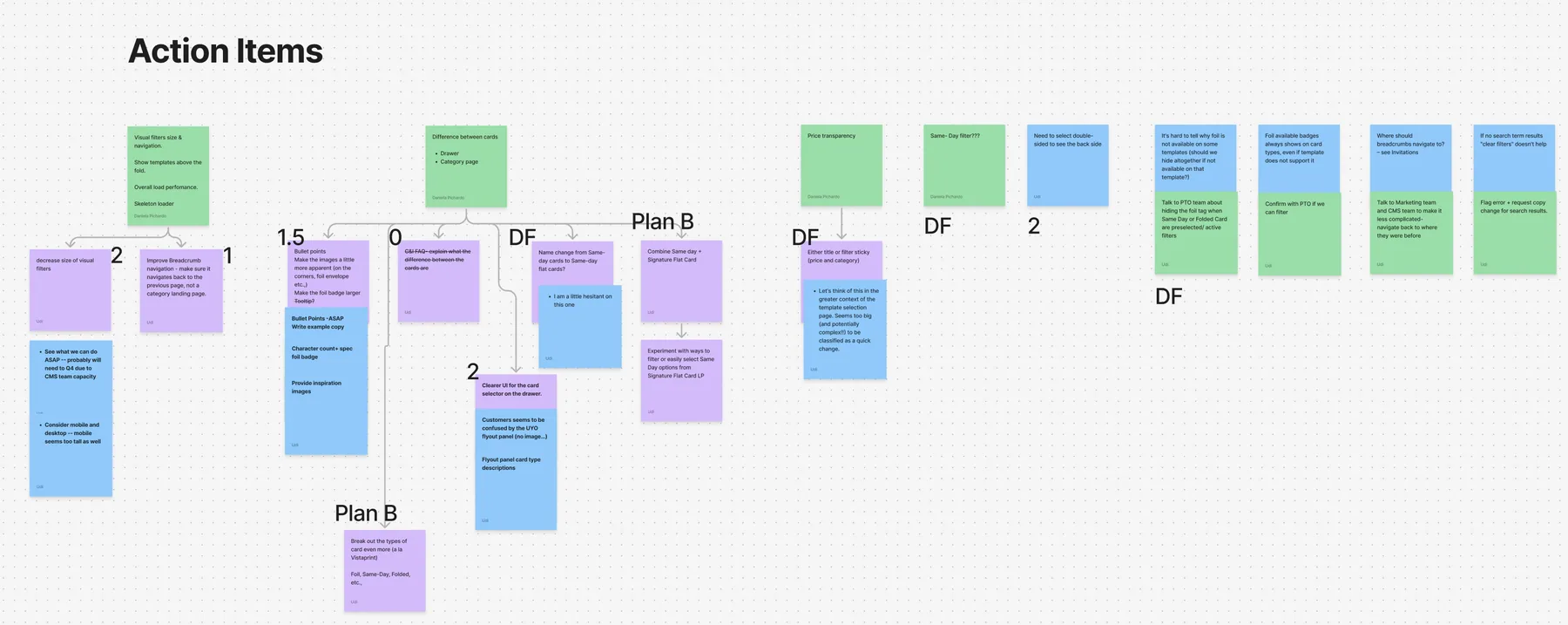
The next steps were to work on the action items, particularly the problem of how to make the card types easier to understand for users.
I did work on this until I was not able to- I focused on making the card selector on the Template Selection Page easier to understand based on some feedback from users- mostly focusing on language and image UI changes:
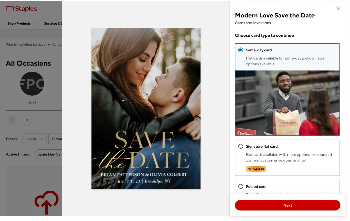
I tested the mockups on usertesting.com and found that although users responded a lot better to the new mockup, there was still some apprehension. The name of the categories, as well as the way/attributes that we had divided them by was a larger issue than how they were presented. I had planned to talk to others on my team about alternative solutions that might require a higher level of decision-making, but at this juncture, the project was put on hold.
Final Notes
At this point the project was put on hold before I could pursue the next step. But the investigation itself surfaced something important: the confusion wasn't a UI problem at its root- it was a taxonomy problem. Users were being asked to differentiate between a fulfilment type (Same-Day Cards) and format types (Signature Flat, Folded), which are fundamentally different kinds of attributes. Presenting them as parallel choices was always going to create confusion, regardless of how well the UI was designed. Had I continued on, my recommendation would have been to revisit the category structure entirely rather than iterate further on the UI. We had previously explored allowing users to select same-day fulfilment as a separate filter rather than a card type- that approach would have let us simplify the card selector to just format choices (Flat vs. Folded), which users understood intuitively. This was a higher-level decision that needed buy-in from product leadership, but the usability data made a strong case for it. It was a reminder that sometimes the most important design recommendation isn't a design change at all.