Project overview
Staples had a "hidden tool" used by Staples print associates, customer service, and on the backend to manage orders called the ATC. It was not an officially sanctioned tool, but an in-store study conducted by others on my team found that associates used it daily in their workflow just as much as they used the official internal work order management tool. They used it to resubmit orders, reorder, and most importantly, do so after editing orders.
Because it was created just for use internally in the backend, the design was simple, and all of the information on the pages were not organized. Nevertheless, it was used by various teams, and all of the information was needed to work on the tool.
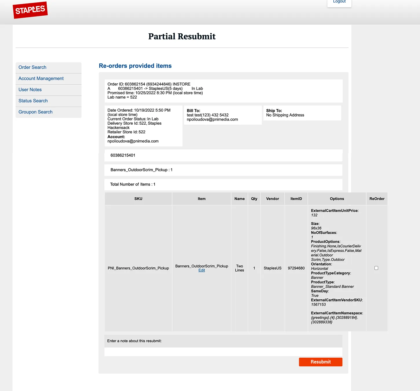
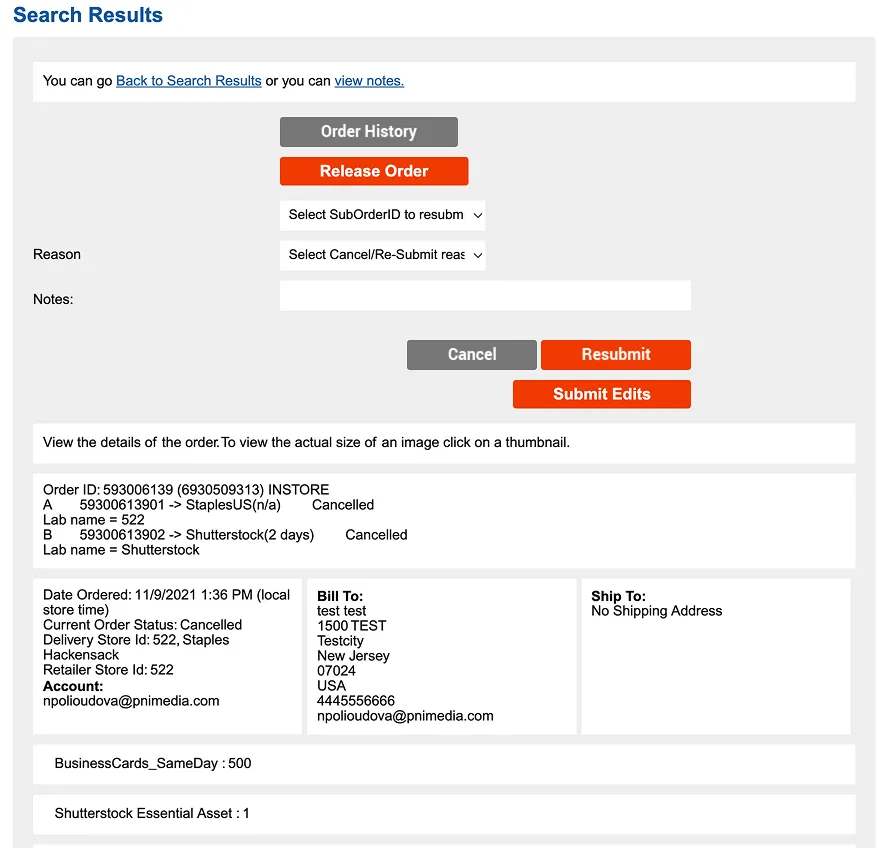
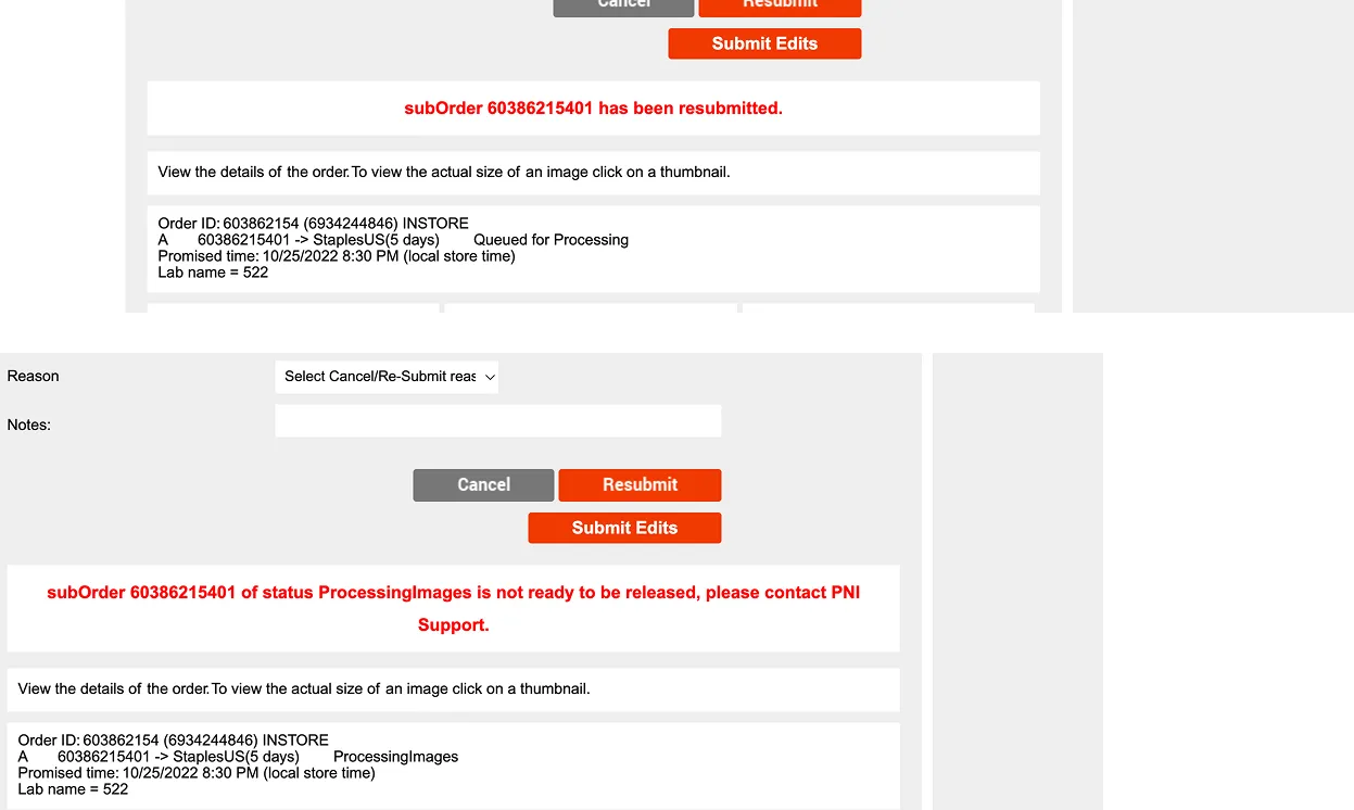
As you can see, the information was hard to parse, and the functions, though they worked, were hard to operate and associates and employees had to do several workaround to make it work.
In addition, this was a very low-priority project, so the dev effort had to be minimal, and all work MVP.
Goals
- Reorganize and redesign the information and UI so that all users can find what they need easily.
- Improve the Resubmit, Edit and Reorder functionalities so that users did not have to complete workarounds to do what they need.
- Keep the improvements and redesign as MVP as possible.
Interviews - Information Restructure
I interviewed print associates, reviewed the in-store interviews, talked to customer representatives and everyone who used the ATC. I walked them through each page, and each component and asked:
- What information do you use on a daily or weekly basis?
- Do you run into any frustrations or problems on this page/component?
I will say this: after conducting user interviews for years in eCommerce with customers on Usertesting with whom I had to finagle this and that way to get information out of, it was a breath of fresh air to interview "B2B customers" (because functionally that's what they are).
eCommerce users have the freedom to choose another website or service anytime, but B2B customers, especially employees have no choice but to learn how to use the program or tool. I found that this meant that B2B customers are very eager to share- almost overshare- exactly what features they have issues with and in immoderate detail. They also had their own ideas about what features they wanted added. Because I wanted to keep the users talking and sharing as much information as possible, I couldn't exactly dissuade them, but we had time limitations, so I found myself letting them share while lightly moderating and steering the conversation back to frustrations instead of suggestions.
The backend print process and order process was also new to me, so I took this as an opportunity to learn exactly how it worked and deepen my knowledge enough to design the dashboard.
I received valuable research, and a lot of it. In the end, I created a matrix (spreadsheet) of what information which teams needed, how much they used it, along with notes on how they caused furstration for the users and got an idea of how to place the data.
Interviews- Functions
As for the Resubmit, Reorder and Edit functions, because this required significantly more dev effort, we knew going into it we had to be conservative with the changes.
From my notes, the biggest problem areas were:
- Users had to create a brand new order for each re-submission or re-order.
- Edits had to be a brand new order.
- There was no way of viewing version histories for edits, or notes associated with the edits.
- The new order was never linked to the old order, and thus users lost all notes and previous information about the order on re-submission.
I did create various versions of the Edit and Reorder functions, and worked closely with the PM of the project to walk through a most viable easy to develop version. In the end, we decided to keep it on hold until the first part- the redesign and restructure was complete and it was put on hold.
Please feel free to contact me for a more thorough walkthrough of the functionalities. Due to the nature of the work, I cannot create a Figma link to it right now.
Information Re-structure and Redesign
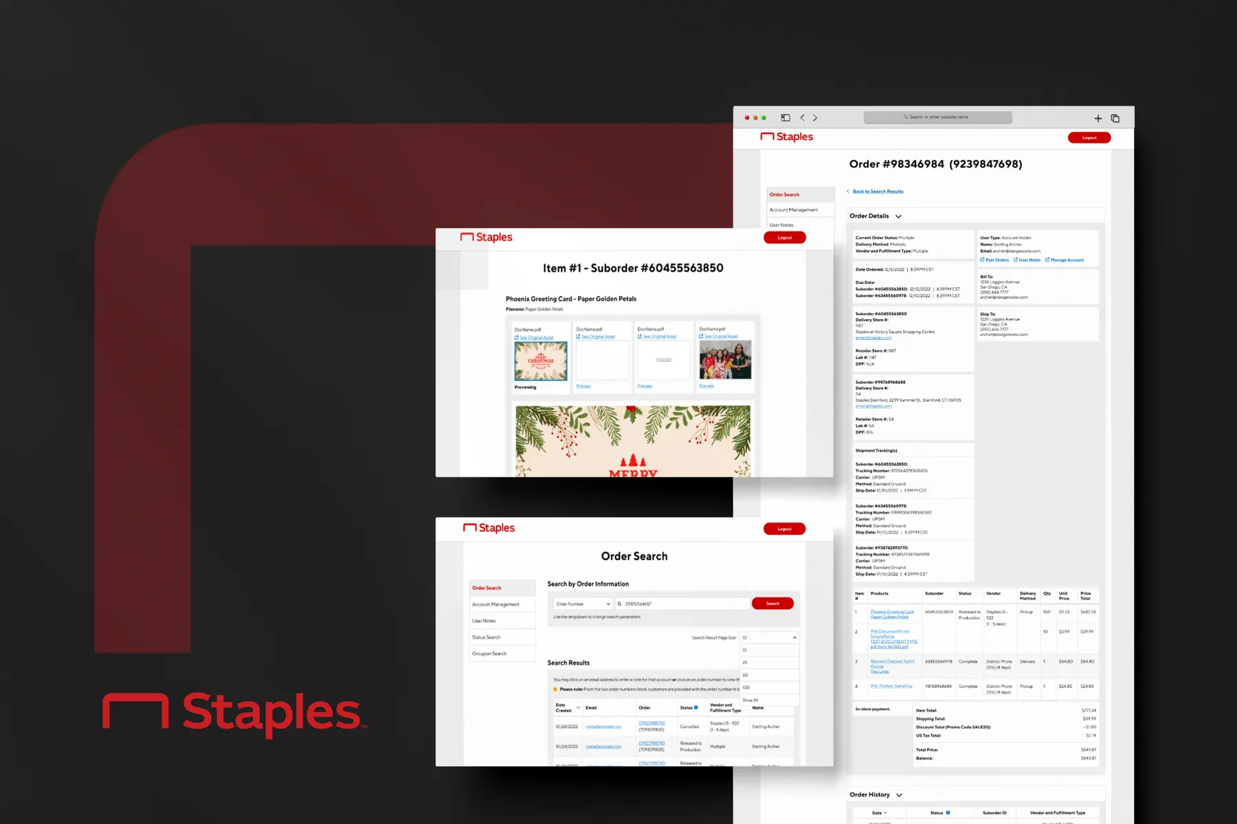
I had to keep the design as close as possible to the original to keep the project MVP while improving readability and usability. I focused on the most used pages- the search results page and order details. I restructured the information on the Order Details page to be easily readable, and placed information in expandable cards (as the page was getting long). I also placed all action items/buttons at the bottom and reorganized.
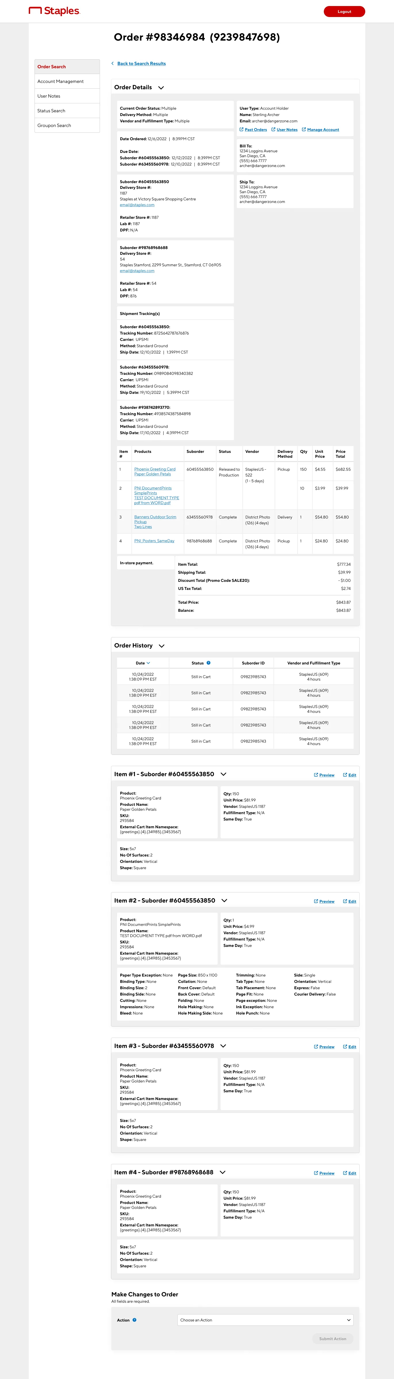
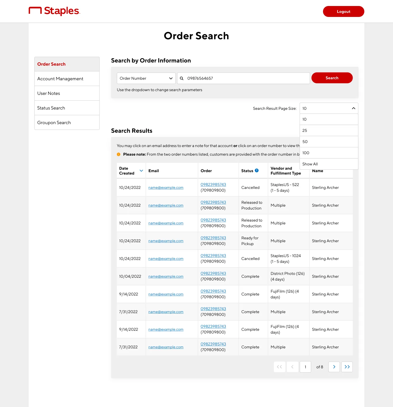
I also made sure, since edits were a main function of the ATC, to make previews easy to see (they had to be opened in new separate tabs before).
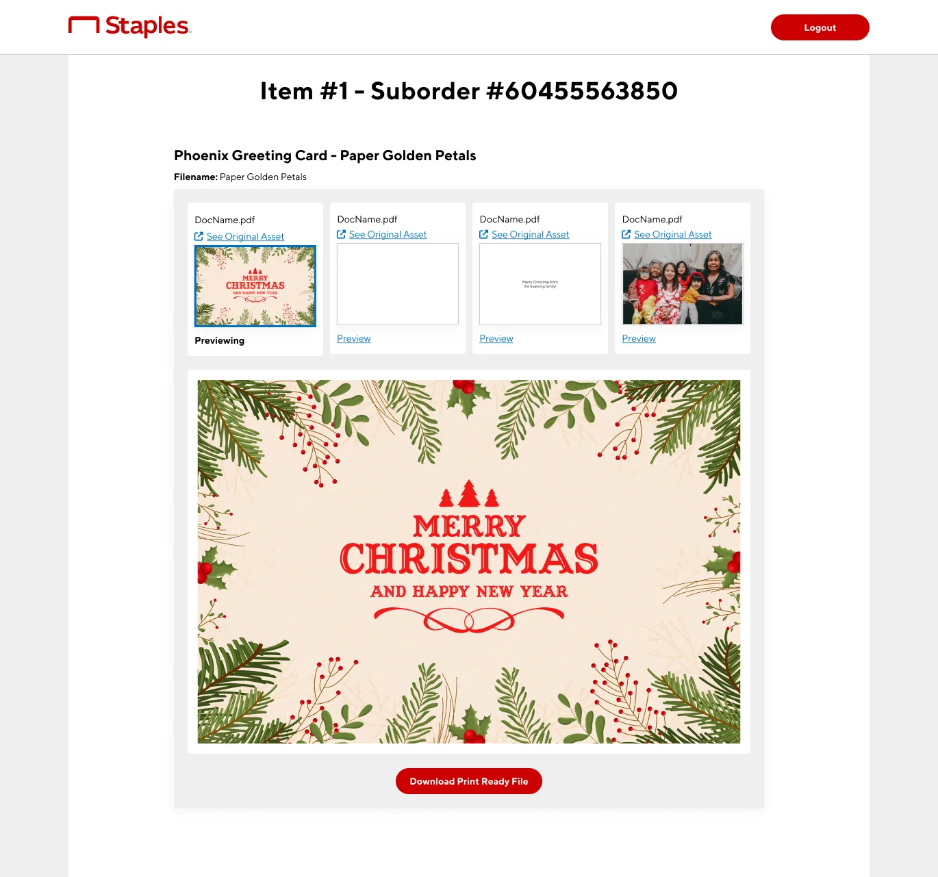
For a more comprehensive look at this project, please feel free to contact me and I can walk you through it. Due to the nature of the work, I cannot create a Figma link to it right now.
Feedback
We did release the information restructure redesign, and found that though the associates wanted the functionality improvements more, they were happy with the redesign and looking forward to more changes- associates still wanted more changes, mostly functionality related. Staples released the ATC as an official tool, and new associates were trained for the new version.