IFN Modern Site Navigation Proposal
Overview
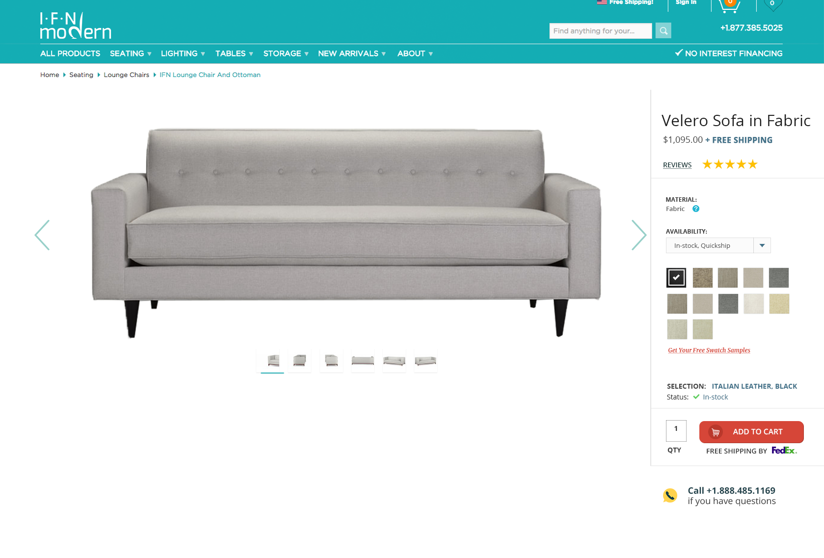
IFN Modern was a mid-century modern ecommerce website. I was tasked to redesign the Product page, and try implementing new features with various AB tests
Main Objectives
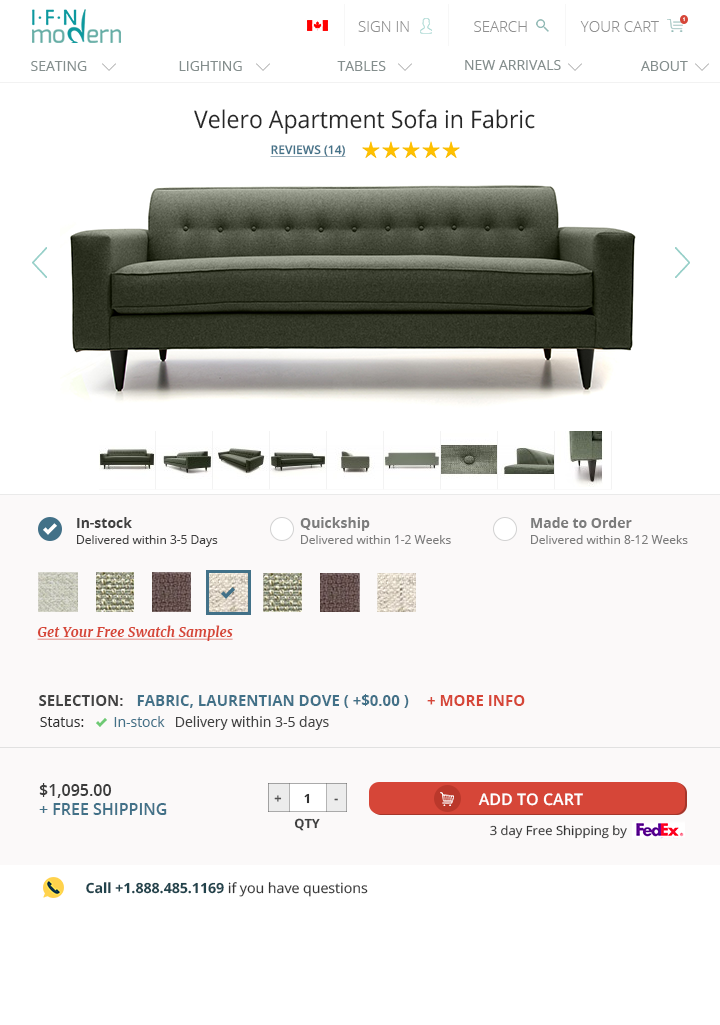
Creating a design specifically for tablet and mobile
Our site was hard-coded, and my employer at the time wanted designs specifically made for tablet and phone.
A way to better implement fabric and wheel options
We had one product in multiple colours and fabric types on one product page. Session recordings showed that users were having problems navigating and choosing their fabrics, colours and other options, so there were a lot of "angry clicks" followed by prompt exits.
Test new feature with AB testing
Throughout the five months and numerous iterations and redesigns, I was also tasked with gauging interest in contacting us to ask about our "custom builds".
Ongoing Research during project
Session Recordings and Heatmaps
We used fullstory, and I monitered and made daily notes with every iteration and design change.
AB Tests
We used AB tests primarily to test the "customization" button/bar.
Usertesting.com Sessions
We did comparitive competitive sessions with UserTesting.com. In these sessions, users were tasked to pretend to be furniture shoppers, and given our product page link as well as competitor's.
Project Insights
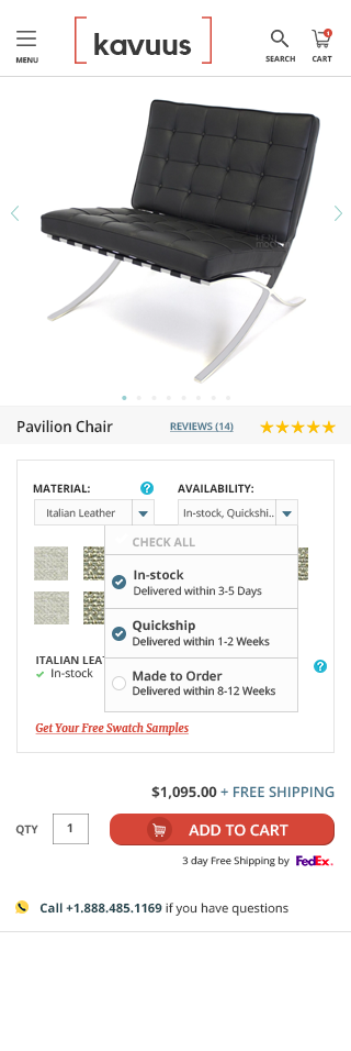
Dropdowns saved visible screen space, but it needed to be as visible and recognizable as possible
As an alternative to hover information, drowdown modeless information was my saving grace. However, it took a couple of iterations to figure out that when the dropdown was overly designed, users missed it entirely. The best and last solution was to create a visible box or border lines above and below a section.
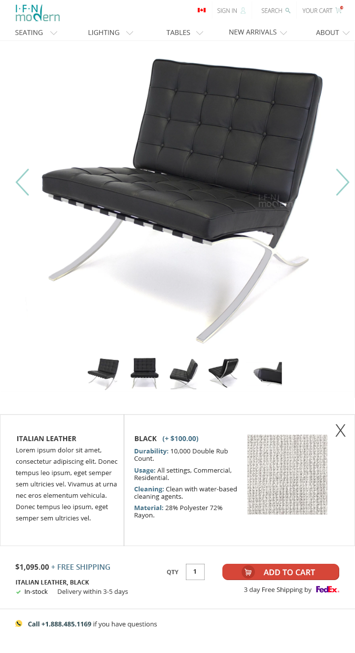
Fabric quality in higher res photos
From the Usertesting.com sessions, the session recordings, as well as information from the customer service team, we found it was pertinent- whatever device the user was on- to have high res images of the fabric, as well as detailed information where available. In the case of furniture shopping, it was important to show quality of fabric, otherwise the users tended to stray away from the page to find the information, or just leave the site.
Language needs to be as simple and straight-forward as possible
This seems obvious, but we found that the more we try to "direct" users to choose various upholstery or material choices, the more they strayed. The biggest example of this is when we tried numbering the dropdown choices (ie: 1. Choose upholstery 2. Choose your legs). In the end, the most effective language turned out to be simply "Materials" and "Legs", as long as the dropdown was clearly and well designed.
Custom builds needs to be separate from the dropdowns
Because the custom builds CTA led to a contact form on a separate page, clicking on it when users were in the middle of choosing their upholstery and materials led to confusion and veered users away.
Finals Designs
ITERATION 1
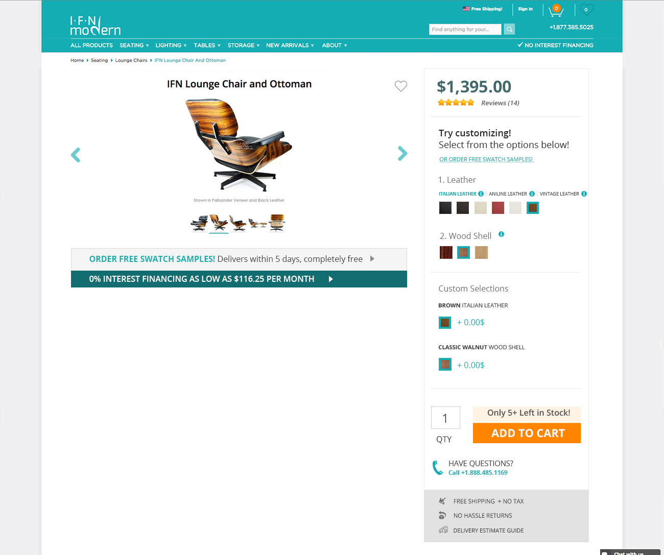
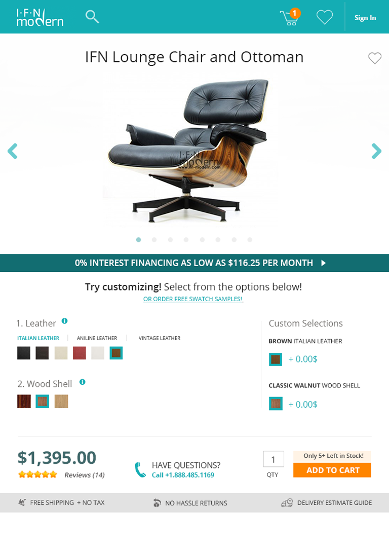
ITERATION 2
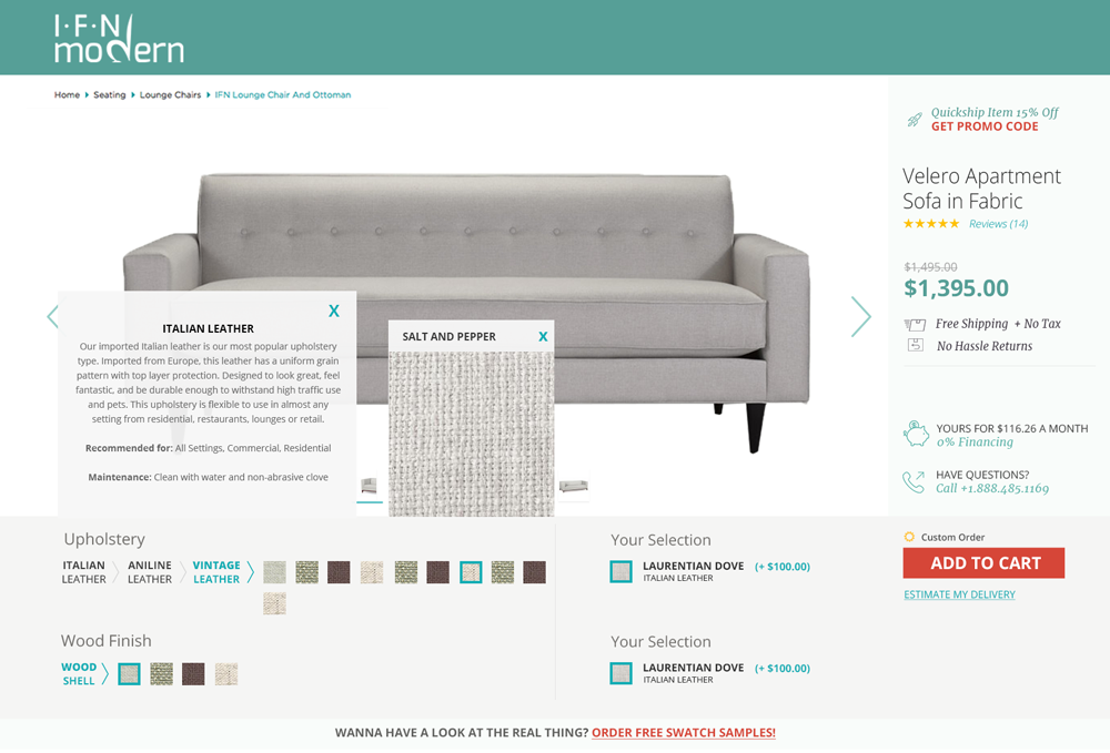
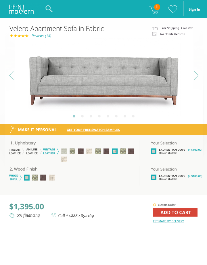
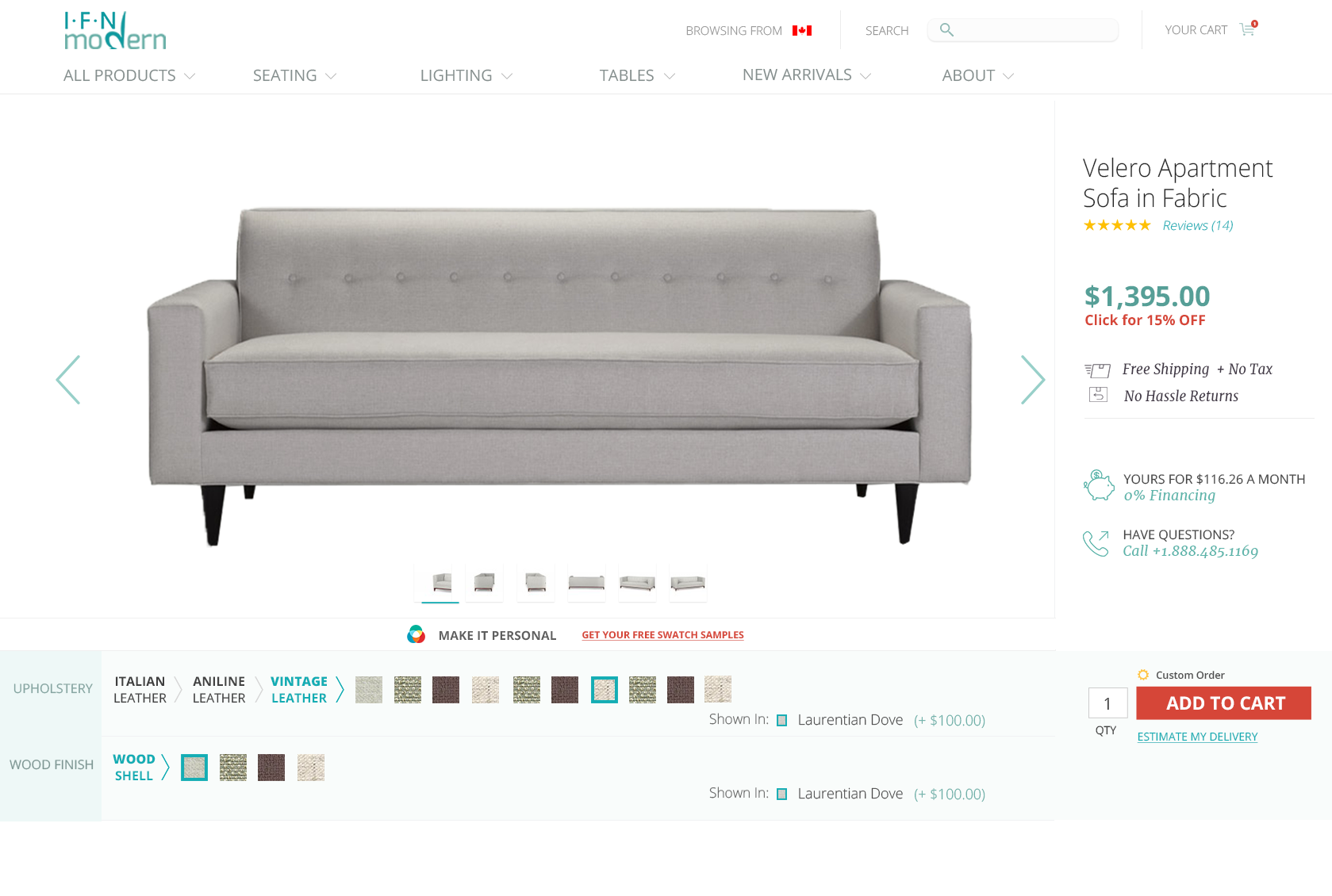
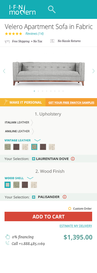
ITERATION 3
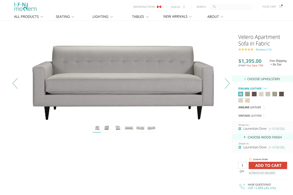
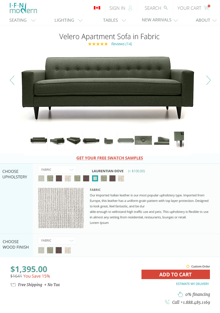
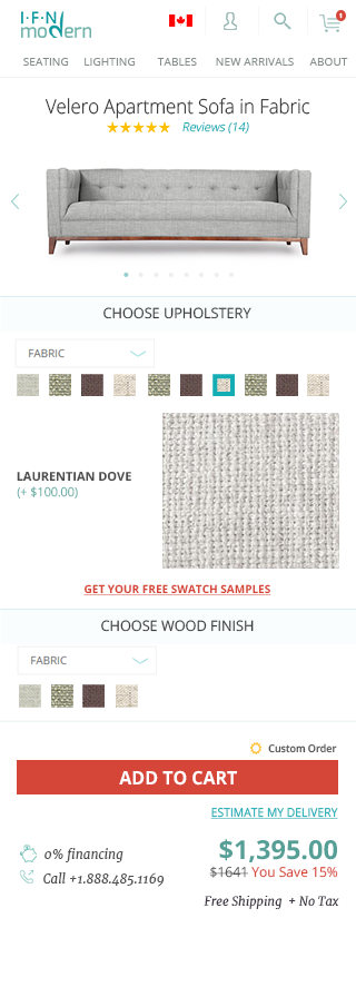
ITERATION 4
