Senior-friendly Web redesign
Overview
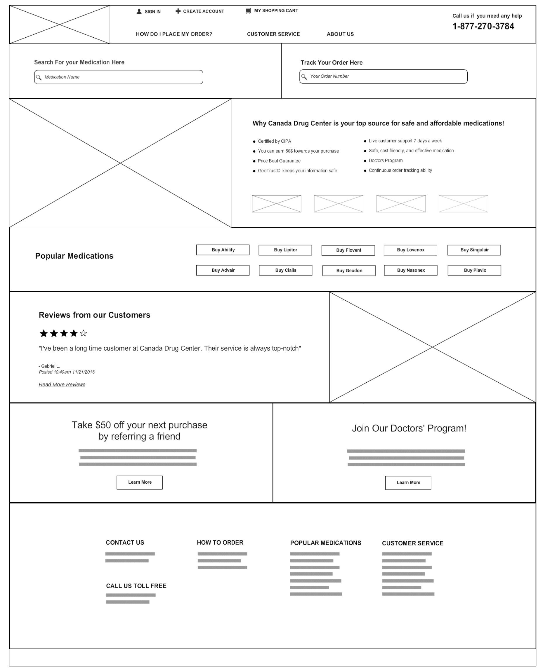
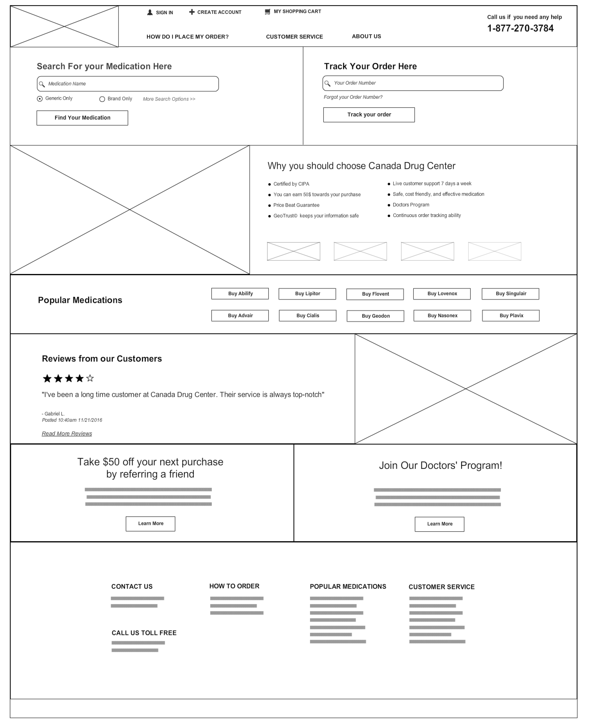
Canada Drug Center needed a redesigned website. The number one concern was that the target user group- seniors- had a hard time navigating the site. I was asked to redesign the home page with this in mind.
Main Objectives
Making it as easy as possible to order online
Many seniors had a hard time navigating through the site to find the order form, or even an order button.

Assuring safety
I was informed that the biggest concern from customers was whether it was safe to share payment information and buy things online.
Legibility
Users also reported that they had great difficulty reading through the mass of information.
Initial Research
Customer service files
I was given access to data with the most frequently asked questions.
Session recordings and heatmaps
I was able to make notes on the last 30 days of session recordings to glean user behaviour on the current site.
Online reading and study
As I was new to senior-friendly web design, I spent a lot of time reading UX articles and learning best-practices.
Project Insights
Users often zoomed in on text. According to NNG, the most suitable font-size would be 16px and up.
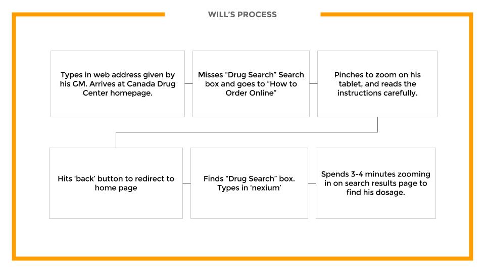
Users often immediately zoned in on the search bar. They knew what they needed to order, but there was no way to look for what they needed.

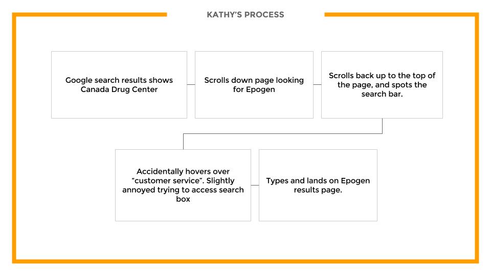
Users even had trouble finding the search bar. There was simply too much information, and a lot of users spent the first few minutes "lost".
IDEATION: User Personas and Siteflows
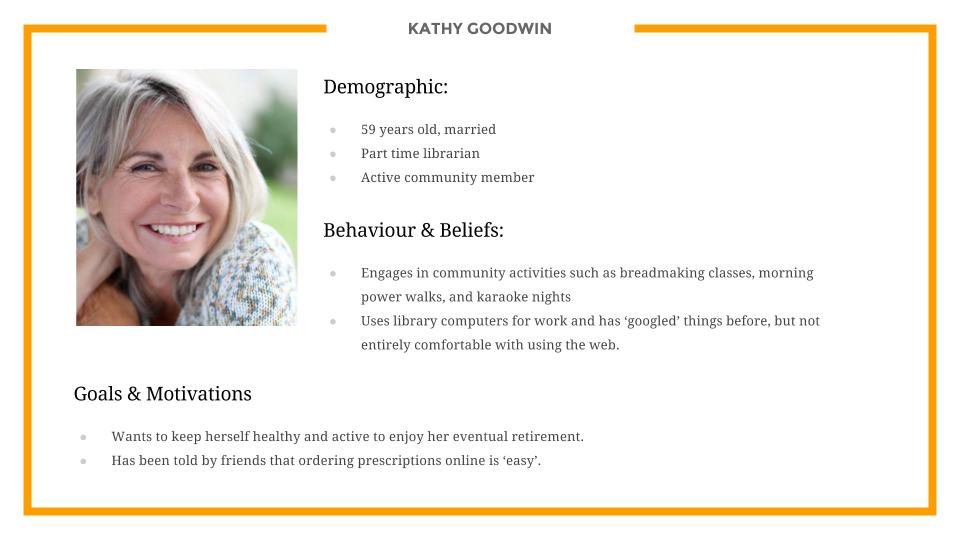
Persona 1: Kathy
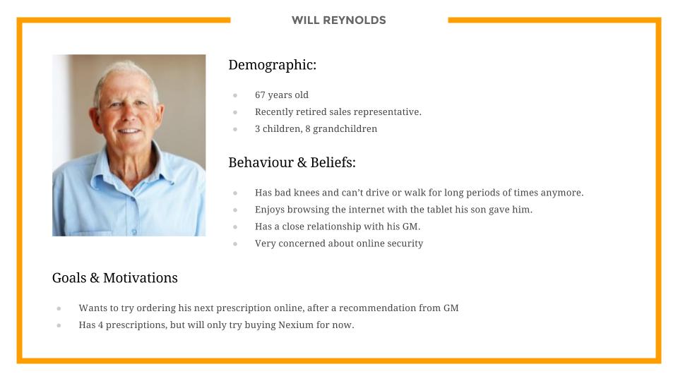
Persona 1: Will
IDEATION: Wireframes
