If you had asked me what I think about hamburger menus 5 years ago, I would've rolled my eyes and given you a long boring lecture, including links to articles and research that pointed to what myself and many other designers at the time thought to be indelible: hamburger menus, while extremely recognizable signifiers, hide the information architecture and hurt discoverability.
But, as other as well as myself have conceded, the ubiquitousness of hamburger menus over time in products as well-known and used as often as Google and Amazon means that we can't exactly throw the baby out with the bathwater. If users know it, and if users know what to expect from it, having hamburger menus at all is an affordance and a tool that we can use. But given it's negative impact on discoverability, the question becomes who can afford to use it?
(Most) Company Websites (mobile)
The biggest problem with low discoverability is the effect- or lack of effect it has on user's conceptual models of the site or app. Without tabs, or a header menu, or a navigational menu, how does the user know what to look for or what the site/app offers?
Most company websites won't have this problem. If I told you to tell me what menus a Construction Company website has, you'd have no problem telling me: Home, Services, About, Contact. Social Media links, if any are in the footer. If your website has just those- no surprises, then there's not much to be lost in terms of discoverability.
Of course, I have to add an addendum that I personally think that because most company websites have fairly simple UI with room to spare, hamburger menus are most definitely not recommended for desktop- unless it's a stylistic choice.
One of the Big Boys
I've already mentioned Amazon and Google as purveyors of the hamburger menu, and I think it works because they know when to use it. Amazon, for example only uses it on their main shopping app, but not Audible or PrimeVideo.
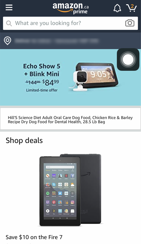

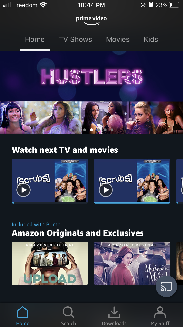
Google's prolific use of the hamburger menu extends as far as the Google Office Suite- but not Maps or Streetview.
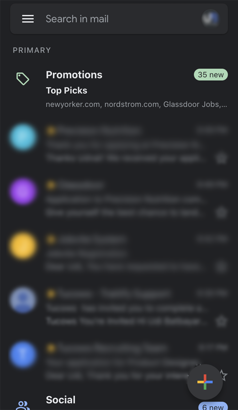
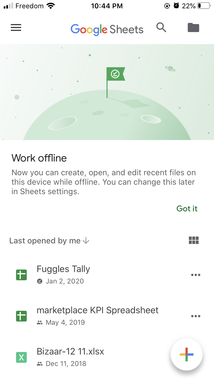
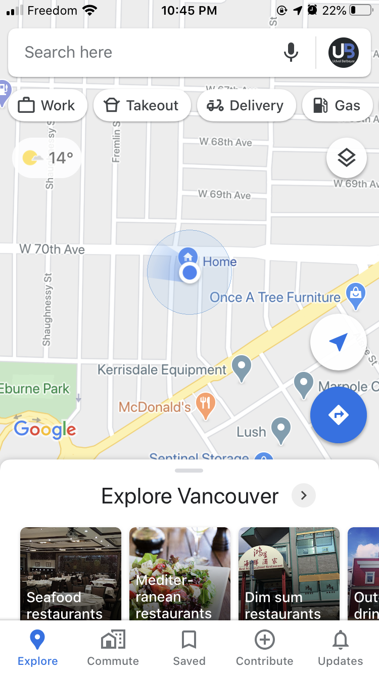
I think the reason these guys can pull it off is because of the frequent use of their products. GMail, and Amazon have been around and used prolifically and daily for over 2 decades now- to the point where users know the conceptual models by heart and instinctively. They can dedicate Home screen space to content, rather than marking a signifier of a home icon on the nav bar. User won't get lost on the Gmail Home screen, or the Amazon app. They know where they are and what to do from there. As for the Google Office Suite- these apps follow the gmail conceptual model to a tee- grandfathering them a familiarity with their information architecture (a feat Google Maps and Streetview can't afford as they have disparate IAs).
Conclusion
I'm not as opposed to the Hamburger menu as I was 5 years ago. It's a useful screen space saver, and shortcut to "Other things that's not on this page right now" but as far as tools on my designer toolbelt, I reserve it's use to singularly special occasions. For now. Who knows what'll happen 5 years from now- I've been wrong before.